Journal topics
- Art (61)
- From the Studio (44)
- Architecture (38)
- Interiors (38)
- Graphic Design (37)
- Illustration (32)
- Product Design (31)
- Photography (29)
- Fashion (11)
- Design Classics (9)
Pasta and Design: From Vintage Posters to 3D Printing
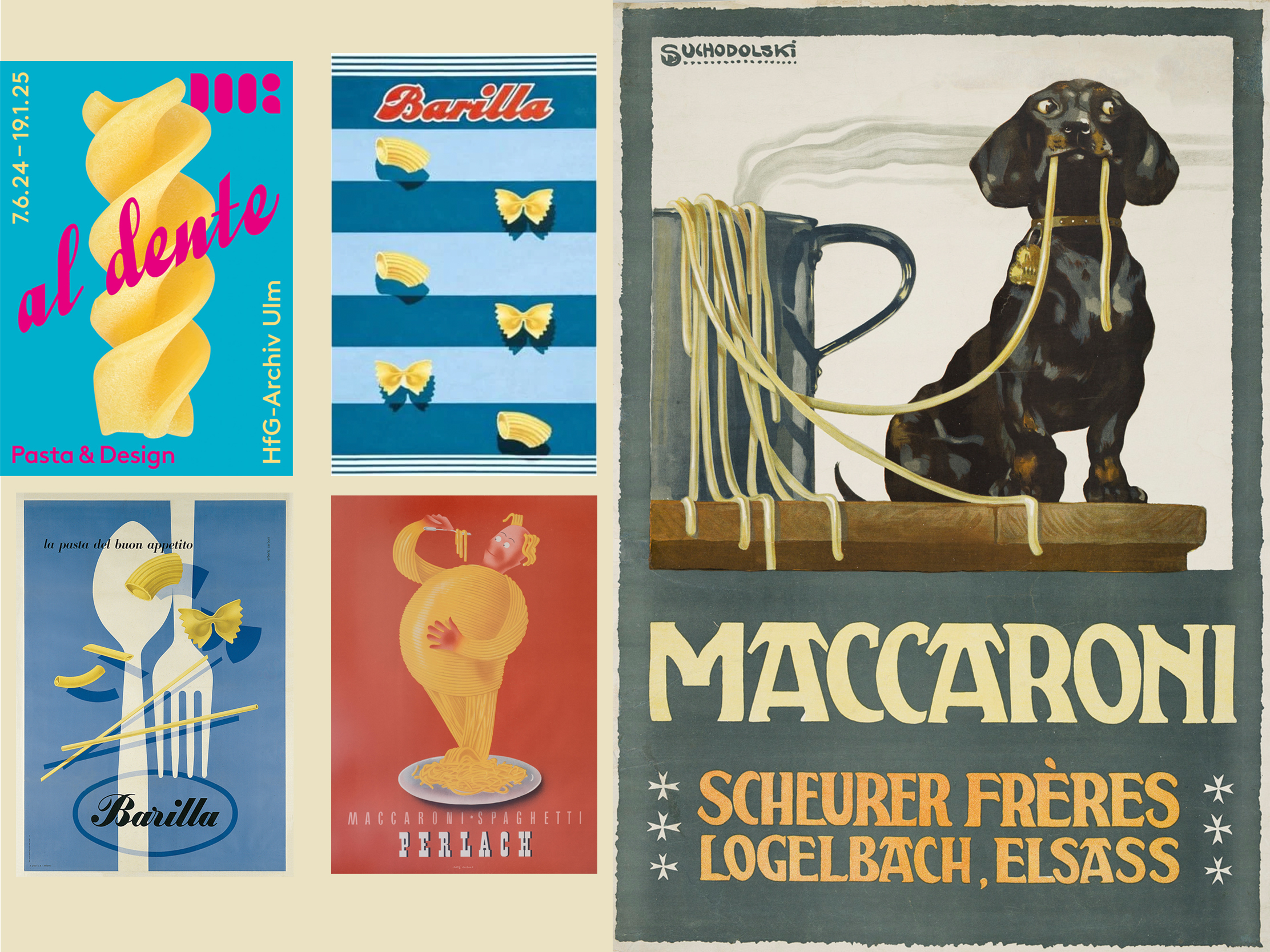
I came across an exhibition at HfG-Archiv Ulm in Germany called Al Dente: Pasta & Design, and it immediately whet my appetite. Not just because it was full of wonderful vintage pasta advertising, but because it treated something we barely give a second thought to as a piece of design.
It sounds wonderfully niche at first, but the more you look at pasta, the more obvious the connection becomes. There is graphic design on the packet, illustration and typography in the advertising, industrial design in the machinery and, rather brilliantly, product design in the pasta itself.
The pasta itself is designed
That was the bit that really caught my attention. We tend to think of spaghetti, penne, farfalle or orecchiette as shapes that simply exist, but pasta doesn’t arrive at those forms by accident. They have grown from regional traditions, methods of making and cooking, and the tools used to produce them.
Shape has a practical job too. A tube, fold, ridge or hollow changes the way sauce, oil and other ingredients behave around the pasta. So there is the same balancing act you find in good product design: how something looks, how it is made and how well it actually does its job.
The Ulm exhibition explored exactly that relationship, from pasta shaped by hand to industrial extrusion and contemporary 3D printing. Appropriately, it was held at the former Ulm School of Design, where designer Walter Zeischegg had already been experimenting with pasta form in the 1960s.
When a car designer redesigned pasta
One of my favourite stories comes from 1983, when Italian pasta maker Voiello asked Giorgetto Giugiaro to invent a completely new pasta shape. Giugiaro was far better known for designing cars, including some of the most recognisable vehicles of the 20th century, so pasta was quite a departure.
The result was Marille, an extraordinary curved form resembling a double rigatone turned inside out. Its outer surface was smooth while the ridges were placed inside, designed to capture sauce. Even more wonderfully, Giugiaro found inspiration for the shape in the cross-section of an automotive door seal.
It looked terrific. Unfortunately, there was a problem. The different thicknesses of pasta didn’t cook at the same rate, and Marille disappeared from production. I rather love that. It is such a neat example of design having to be more than beautiful. A piece of pasta can fail a usability test just as effectively as a chair, kettle or car.
Pasta as graphic design
Then there is everything that happens before the pasta even reaches the pan. Vintage pasta advertising is glorious territory for a graphic designer. Bold illustration, expressive lettering and great slabs of colour transformed a very simple product into something filled with appetite, sunshine and a sense of place.
There is something lovely about graphic history surviving on ordinary things. We found the same thing when looking through some vintage stationery packaging. Things made to be used and thrown away can end up preserving typography, illustration and branding more vividly than something intended to be kept forever.
Food packaging gives designers an especially good canvas because it has to work hard. It needs to be noticed, recognised and understood quickly, but it can also communicate flavour, origin, quality and personality before you have tasted a thing. We went down a similar rabbit hole a few years ago with some particularly lovely chocolate packaging.
When fashion dresses the pasta
Perhaps the most exuberant example is the collaboration between Dolce & Gabbana and Pastificio Di Martino. Since 2017, the fashion house has covered the Italian pasta brand in the colours, patterns, landmarks and Mediterranean imagery we associate with its visual world.
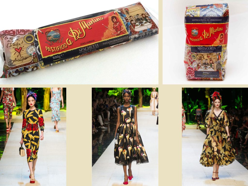
It’s a great example of packaging becoming more than protection for the product inside. The packets become little pieces of Italian theatre in their own right, taking something inexpensive and familiar and treating it with the visual confidence of fashion packaging.
Jamie Oliver’s Pasta Dreams took a very different route. Design studio Otherway deliberately stepped away from the visual clichés of traditional Italian food and created something warmer, younger and decidedly psychedelic. Pasta ribbons, ingredients, blobs and swirls become patterns and animations, with peach, orange and brown giving everything a wonderfully retro flavour.
And then somebody 3D printed it
Of course, once designers start looking at the pasta itself as an object, it is only a matter of time before technology gets involved.
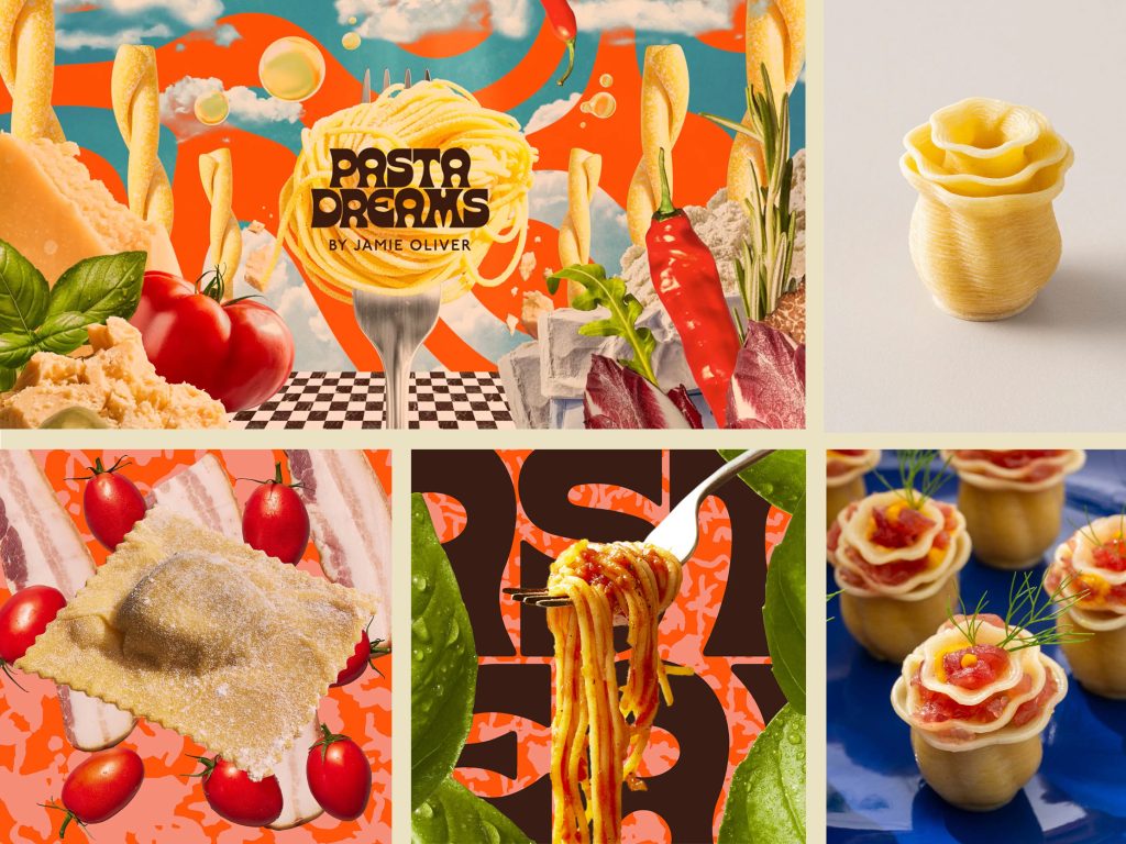
Barilla began exploring 3D printing as a way of creating pasta forms that conventional extrusion couldn’t easily achieve. That work developed into BluRhapsody, where pasta can curl, fold and build upwards into shapes that begin to look more like tiny pieces of architecture.
This is where pasta becomes almost impossible to separate from product design. The designer is thinking about structure, manufacture, material and appearance, except the finished object also has to survive boiling water and taste good.
We have been fascinated before by the way 3D printing allows designers to create forms that would be extremely difficult using traditional manufacturing. Our Breaking the Mould with 3D Printing post looked at the same principle applied to woven-looking concrete furniture. Pasta might be a rather more delicious material, but the attraction is remarkably similar.
A lot of design for a humble bowl of carbs
So perhaps pasta and design isn’t such a peculiar combination after all. From a hand-shaped piece of dough to an extrusion die, a vintage advertising poster, a brightly printed packet or a 3D model, somebody is making decisions about form, function and how we experience it.
I started with some lovely old posters and ended up with automotive designers and digitally printed pasta. That’s quite a journey for something I usually cover in tomato sauce.
Featured image sources: Al Dente: Pasta & Design, HfG-Archiv Ulm and vintage pasta advertising. Dolce & Gabbana imagery originally found via MOLD. Pasta Dreams imagery via Creative Review. 3D printed pasta imagery by BluRhapsody.