Journal topics
- Art (60)
- From the Studio (44)
- Architecture (38)
- Graphic Design (37)
- Interiors (37)
- Illustration (32)
- Product Design (31)
- Photography (29)
- Fashion (11)
- Design Classics (9)
Vintage Stationery Packaging
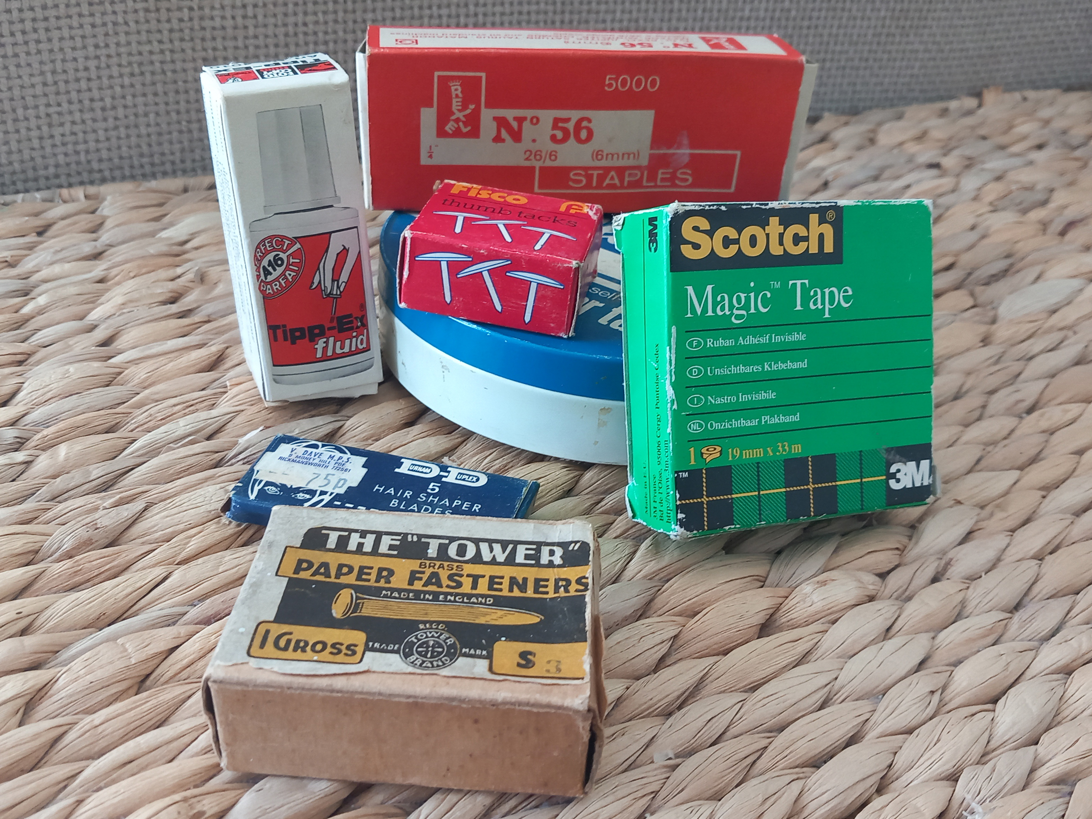
These kinds of things might look like junk to some, but for a graphic designer, finding vintage packaging is a joy! My sister has been working her way through my late Dad’s study. He was quite a ‘just in case’ kind of guy, which meant there were plenty of things for us to sort. Recently, my sister started tackling the stationery supplies, and I loved some of the retro packaging so much that I thought I would share it with you.
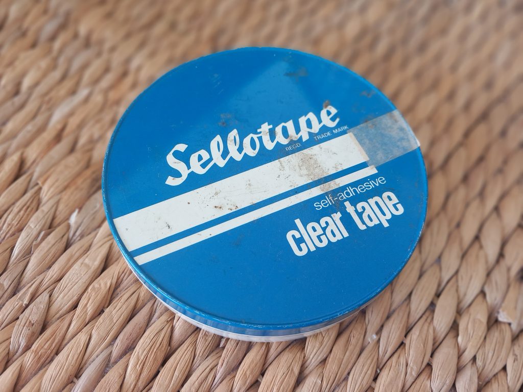
First up, Sellotape. These metal tins were produced from the brand’s beginnings in 1937 right through to the 1980s. Ours looks as though it might be a later design, perhaps from the 1970s or 1980s. Quite a lovely thing, and much better than wrapping the rolls in cellophane!
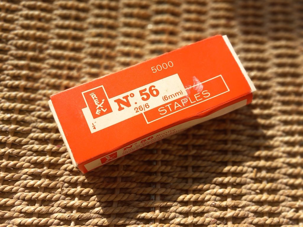
This bright red box of staples has the most adorable logo, known as the ‘Little Man’. It was introduced in 1958 by Rexel, a company that is still going strong. The business was founded by George Drexler, who moved from Prague to London and started his own stationery company in 1939.
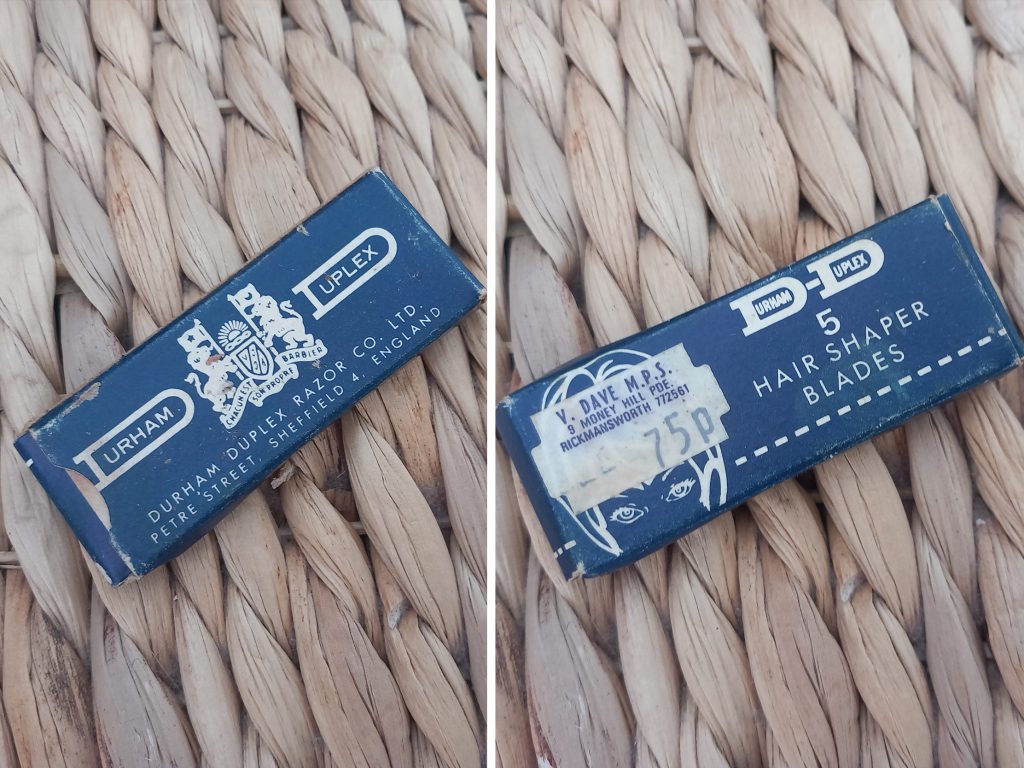
I reckon these razor blades must have belonged to my Nan, as she sometimes cut hair and lived in ‘Ricky’. The retro illustration is lovely, although the man with a full head of hair doesn’t look particularly keen to have it cut! Durham Duplex began in New York in 1875, despite its rather British-sounding name, and its Sheffield roots date back to 1910. The company still uses a logo with a distinctly retro feel.
This box looks as though it could be from the 1970s, although the price label seems newer. The Durham Duplex system was quite revolutionary at the time because the blades could be sharpened almost endlessly. I love that these still have the price on them!
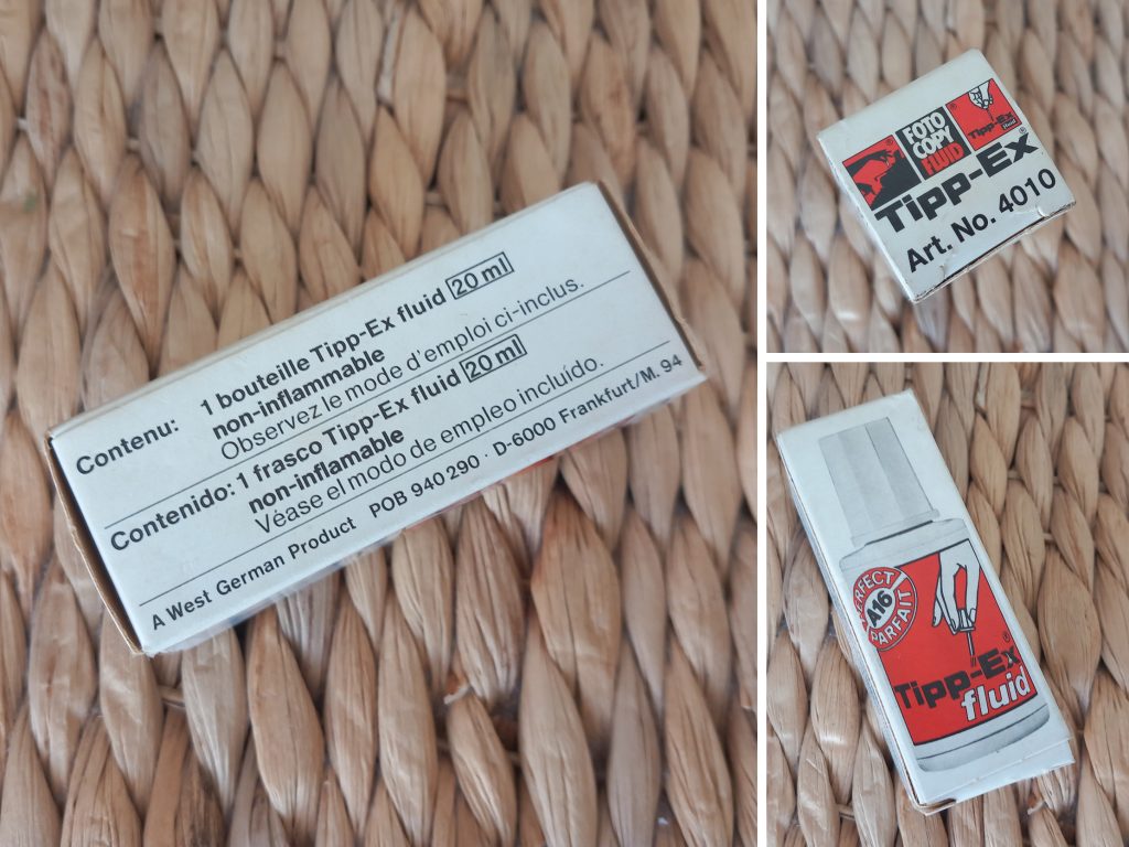
Tipp-Ex is an old familiar one. I can’t say I have used it in years, but it was pretty vital when I was doing homework with all my spelling errors. Thank goodness for spellcheck!
It began as a German company in 1958, initially selling correction paper for typewriters. The name combines the German word ‘Tipp’, meaning ‘to type’, with the Latin ‘Ex’, meaning ‘no more’. The box says ‘Made in West Germany’, so it must predate the 1990s. It resembles some 1960s designs I found, but I would be very surprised if it were that old because it hasn’t completely dried up!
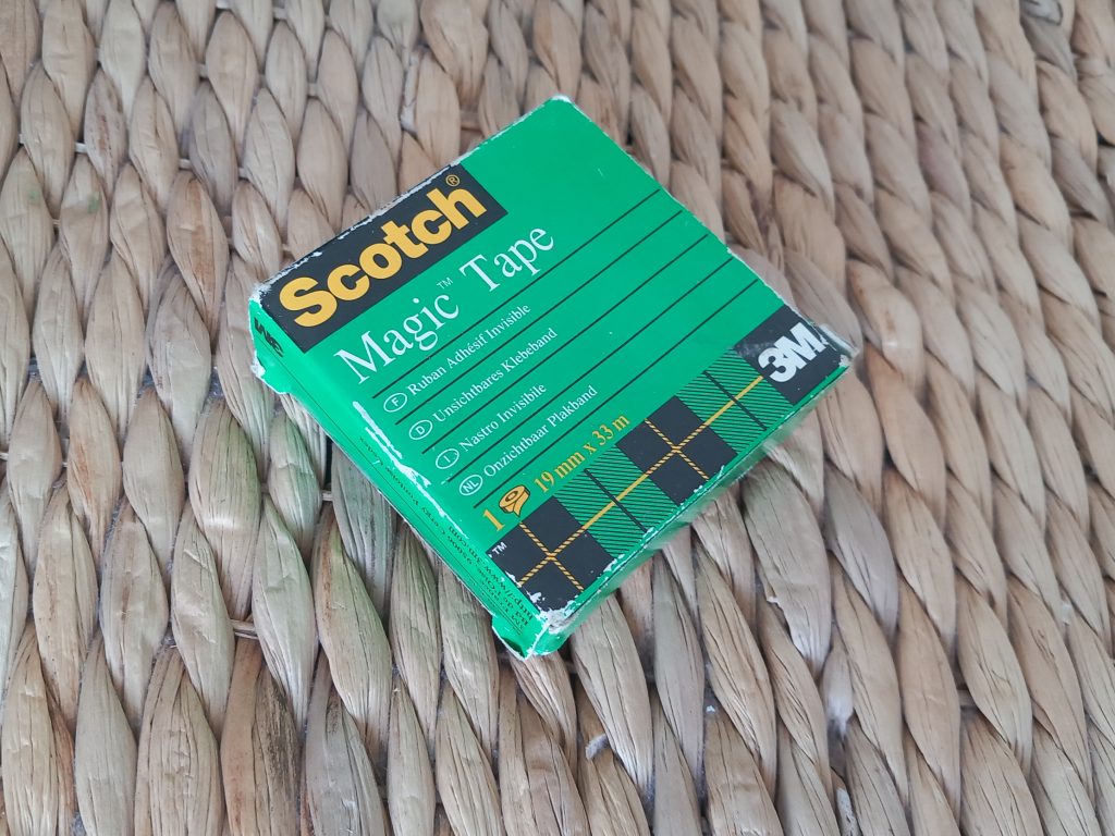
There is a fascinating history of Scotch tape and its inventor, Richard Drew. The first patented Scotch tape was masking tape. Drew had made a bold promise that he could solve the masking problems encountered when painting cars.
Two-tone cars were all the rage in the 1920s, but producing clean paint effects without damaging the surface was tricky. It took him two years, but he cracked it. Magic Tape arrived in 1961. It was not only nearly invisible but could also be written on with pen, pencil or marker.
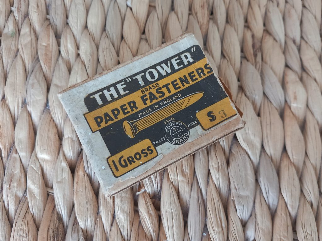
This tiny box of split pins feels pretty old! I can’t find anything definite about the brand online. There is a British kitchenware company called Tower, founded in 1912, so it is possible these came from them. Another possibility is a Tower brand founded in Wales in 1894, now owned by Schneider Electric, which began by making nails. My grandad was Welsh, which makes that theory rather appealing.
The ‘1 Gross’ puzzled me, but it is a unit of measurement. My dad would have known that! It means 144 items. So I still have no idea when the box is from, but it looks pretty cool.
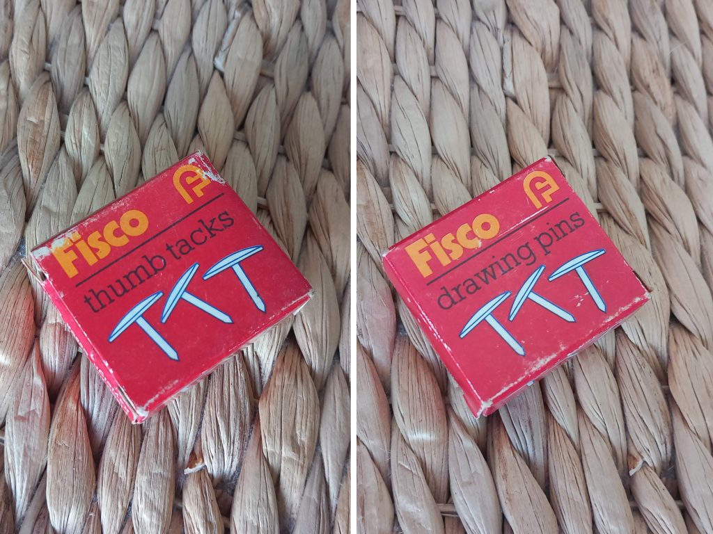
Covering all bases, these Fisco drawing pins are also labelled ‘thumb tacks’. The lovely retro logo looks as though it is from the 1960s, although it was used for many years, so it is hard to be certain. Fisco was founded by Leo Fisher in a London cellar in 1940, making drawing pins and upholstery nails. The company later branched out into measuring tapes.
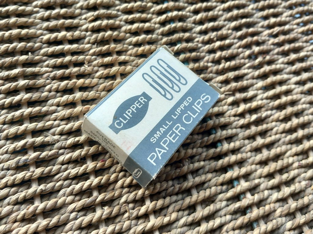
I found a similar box of these paper clips on Etsy, described as having been made by Scovill in England in the 1950s. They are still perfectly usable, with no rust at all!
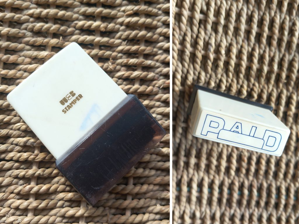
I couldn’t find anything about the history of ‘Web’, but I love the logo. A little touch of gold glamour when stamping your bills ‘paid’!
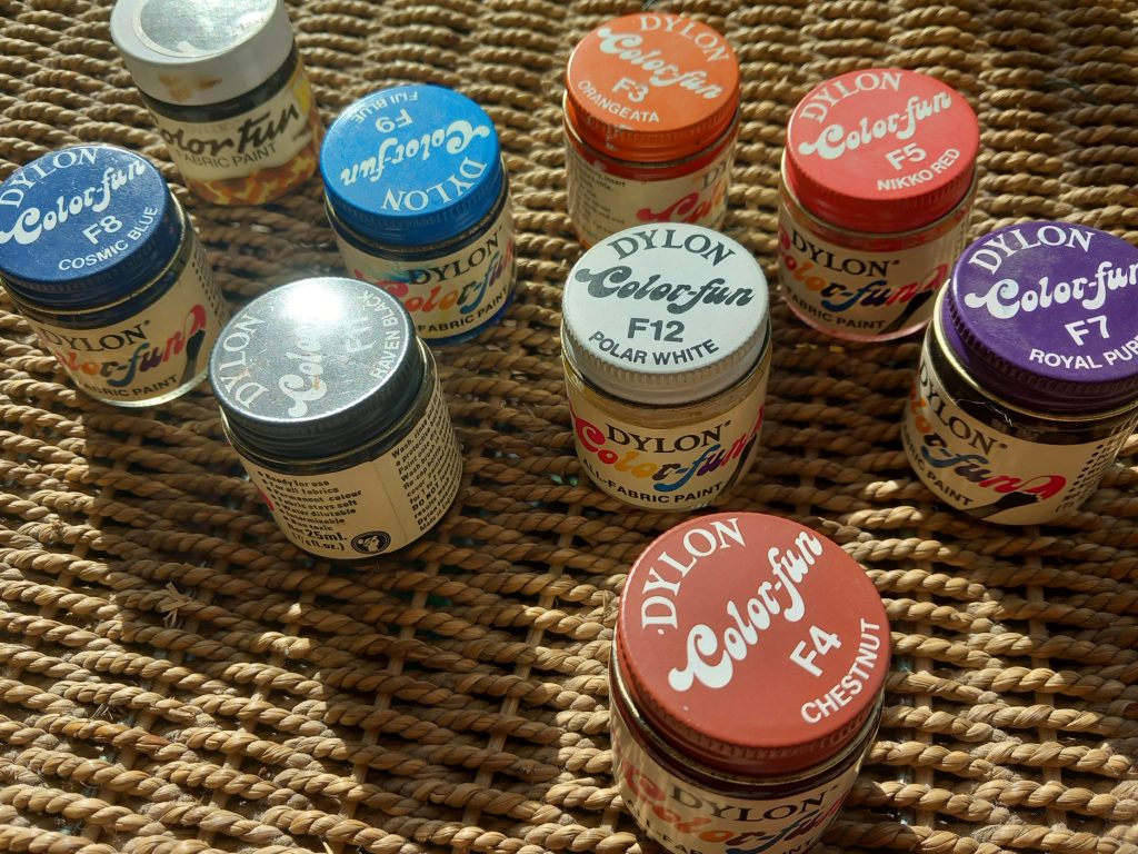
Finally, my sister found these little jars of fabric paint. The ‘Colour-fun’ logo has a beautifully fluid retro feel. Dylon is still going strong today. It was founded in London in 1946, when the ‘make do and mend’ spirit was still very much alive.
Just a little dive into branding history! I do love a bit of retro, and it is lovely to see the layout, typography and design applied to simple things like stationery. All of it preserved in my dad’s rather random study!