

Penrose Touring Business Cards
Carrying the new identity into print
Once the Penrose Touring rebrand was complete, we developed a set of business cards that carried the new identity into everyday use.
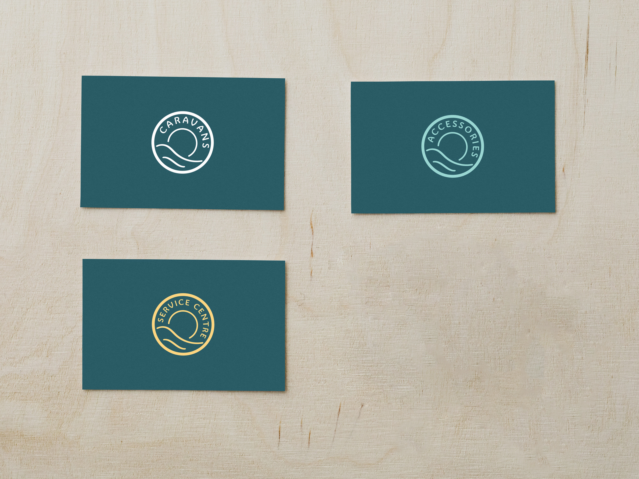
Rather than producing one generic design, we created complementary versions for the different areas of the business. Each uses the same underlying identity and typography, while colour makes it easy to distinguish between caravans, accessories and servicing.
Different colours, one recognisable brand
Teal represents caravans, turquoise accessories and yellow servicing. The circular brand element could then be combined with supporting text in different ways, giving each card its own character without losing the connection to the wider Penrose identity.
The result is a simple example of a brand system doing what it should: remaining consistent while adapting naturally to different parts of a business.
More work for Penrose