

Image 1 of 5
Penrose Touring
One identity for a well-established Cornish business
Penrose Touring is a well-established Cornish company based in Scorrier, selling caravans and accessories alongside their caravan servicing business. They asked us to bring the different sides of the company together under one clear, recognisable identity.
We developed the brand around the idea of a journey. A flowing line suggests both a road and a wave, while a separate circular element incorporates a setting sun to introduce a subtle sense of holidays and travel. That movement was carried through into the typography, creating an identity that feels confident without becoming too corporate.
A simple colour system helps distinguish the different areas of the business: teal for caravans, turquoise for accessories and yellow for servicing. Each has its own character while remaining unmistakably part of Penrose Touring.
Designed to work far beyond the logo
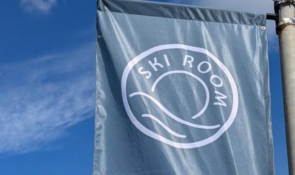
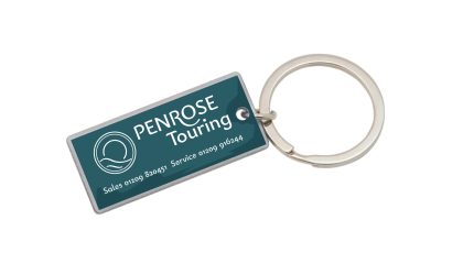
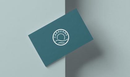
From the outset, the identity needed to be flexible. We developed it across business cards, forecourt flags, signage and promotional items, adapting the elements to suit very different applications without losing the consistency of the overall brand.
That included everything from large external flags to small details such as metal key rings and caravan hitch covers. It is a good example of why a useful brand identity needs to do more than look good in isolation – it needs to keep working wherever the business needs it.