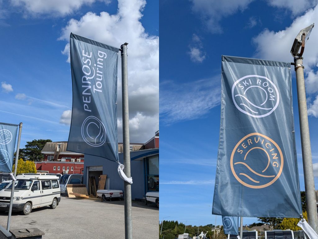
The flags we designed are single sided and fitted their existing flagpoles, drawing attention to their new branding.
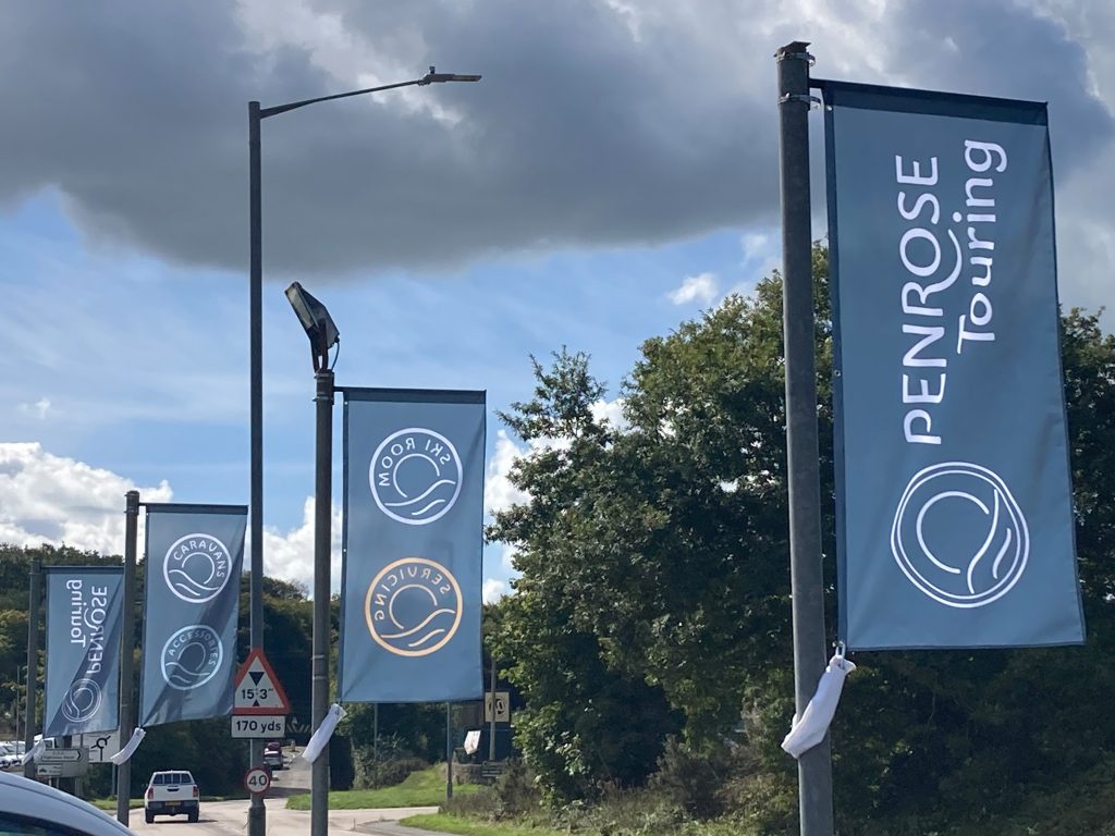
The four forecourt flags we designed feature Penrose Touring's logo along with the different services they provide.
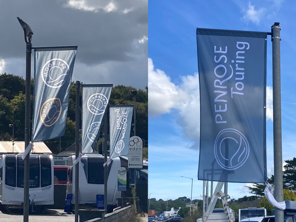
Placed alongside a road with plenty of passing traffic, these flags draw attention to the business. A very effective form of marketing.
Penrose Touring
Penrose Touring asked us to design some flags to go outside their premises featuring their new logo and highlighting their services. They had to be eye catching and work from both directions so that passing traffic are able to quickly see what is available.
Follow this link to see more examples of our signage design.
< Back to Penrose