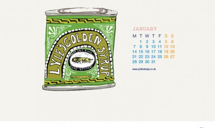
January
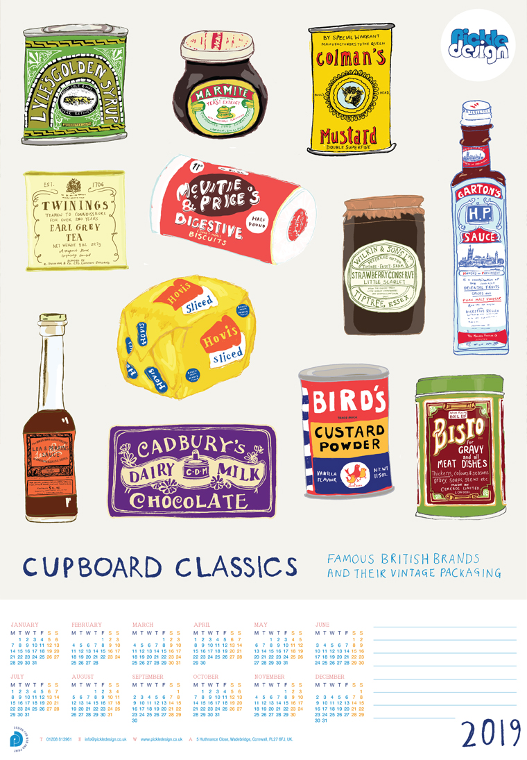
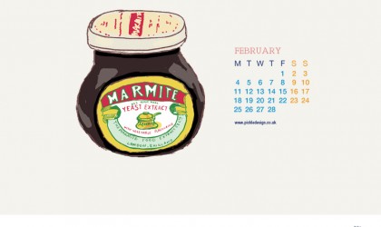
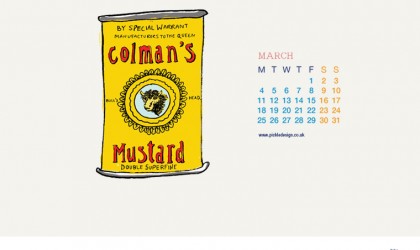
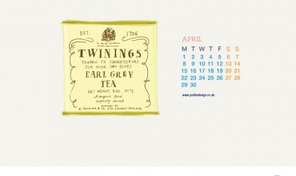
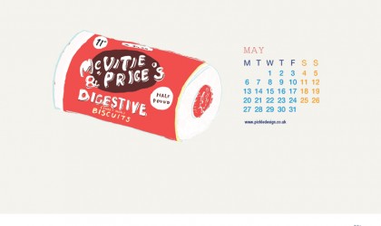
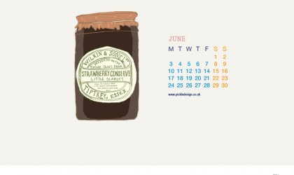
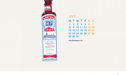
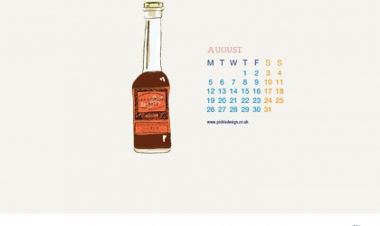
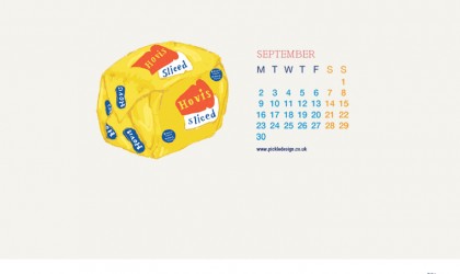
For our 2019 calendar we picked up pen and paper and decided to capture what our cupboard favourites looked like at the beginning. Packaging has always been a bit of a passion at Pickle, and these are a few of our favourite things, but not quite as you might know them.
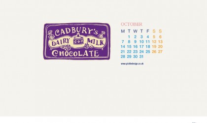
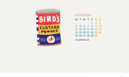
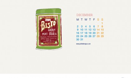
Picking just 12 for the poster calendar wasn’t easy, but we managed to include plenty of familiar names, from Cadbury’s Dairy Milk to ‘Aah, Bisto!‘ gravy. The idea was to go back beyond the packaging we recognise today and look at how some of those cupboard classics first presented themselves.
Emma hand illustrated each piece of packaging, preserving the colours and character of the originals rather than simply reproducing old photographs. Some were much harder to research than others, so there was a fair bit of detective work involved in tracking down early versions of brands that are still instantly recognisable today.
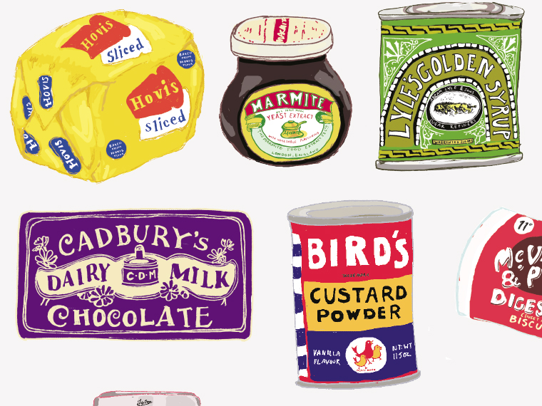
When we first shared a little preview of the drawings in October 2018, Emma said she’d enjoyed getting out the pen and paper and getting to know every detail of the vintage favourites and the stories behind them. That research became part of the fun of the calendar, as well as giving each month’s illustration something more to explore than the packaging alone.
One of the interesting things about putting these brands side by side is seeing how much can change without making them unrecognisable. Logos are redrawn, type becomes cleaner, packs simplify and printing changes, yet a familiar colour, shape or piece of lettering can survive for generations. Packaging does much more than contain a product. Over time, it becomes part of how we remember it.
We came back to that idea a few years later when Emma wrote about London’s Museum of Brands. Its collection turns everyday wrappers, tins and boxes into a record of changing tastes and graphic design, and our 2019 illustrations crop up there too. There is something particularly satisfying about seeing objects that were never intended to last becoming little pieces of design history.
We found much the same thing closer to home in our collection of vintage stationery packaging. Old Sellotape tins, staples, drawing pins and Tipp-Ex boxes may be very ordinary objects, but the typography, illustration and colour tell you immediately when they came from.
And looking backwards doesn’t only appeal to collectors. Designers continue to borrow from earlier visual styles when creating something new. Over on Design Debate, Emma picked out the deliberately retro-feeling packaging for Wauw ice cream, where bold type, simple shapes and warm colours give a new food brand a character that feels oddly familiar.
The finished calendar brought those 12 illustrations together as a poster, with each month taking a closer look at a different piece of packaging. Browse the monthly artwork below to see the individual designs and the stories behind them.
Browse the monthly artwork from this Pickle Calendar.