Journal topics
- Art (61)
- From the Studio (44)
- Architecture (38)
- Interiors (38)
- Graphic Design (37)
- Illustration (32)
- Product Design (31)
- Photography (29)
- Fashion (11)
- Design Classics (9)
Museum of Brands: Packaging, Memory and Design
The everyday design that stays with us
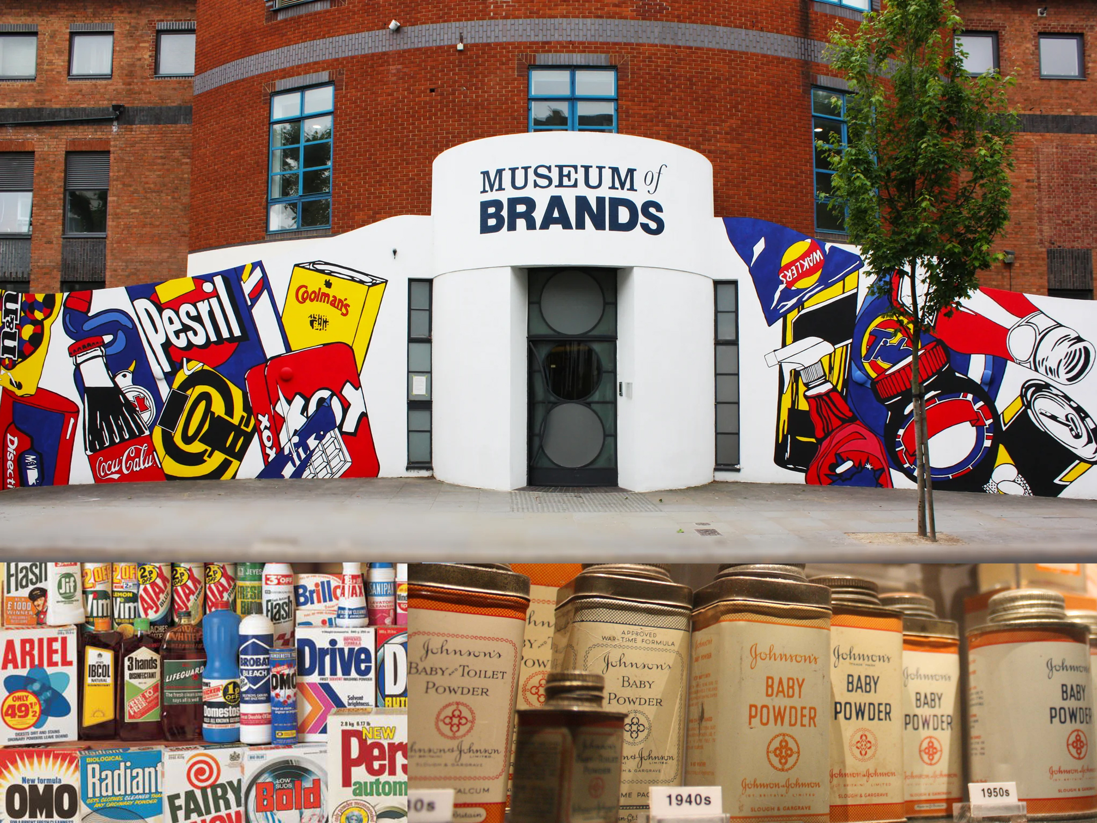
London’s Museum of Brands feels very British. Which of course it is. Its collection takes you through 200 years of consumer culture, using packaging, advertising and familiar everyday objects as a lens through which to see our social history and changing tastes.
As a graphic designer I must say I have always been captivated by brands and their evolving designs. On the rare occasion I venture into those posher supermarkets, like Waitrose, I just love to look down the aisles of chocolate and coffee, the colourful boxes of tea, or elegant and vibrant wine labels, just to see the wealth of creativity displayed.
A strange fascination I know. The wonder of the Museum of Brands is that it displays the everyday, normal items that have been the wallpaper of our lives. It is in looking back that nostalgia kicks in and you can really appreciate how design becomes such a strong part of our memories.
Brands, memory and dementia
The collection grew from the work of consumer historian Robert Opie, who began collecting packaging and everyday objects more than fifty years ago. In 1984 he opened the first museum devoted to the history of packaging and advertising, and the collection eventually found its current home near Portobello Road in Notting Hill.
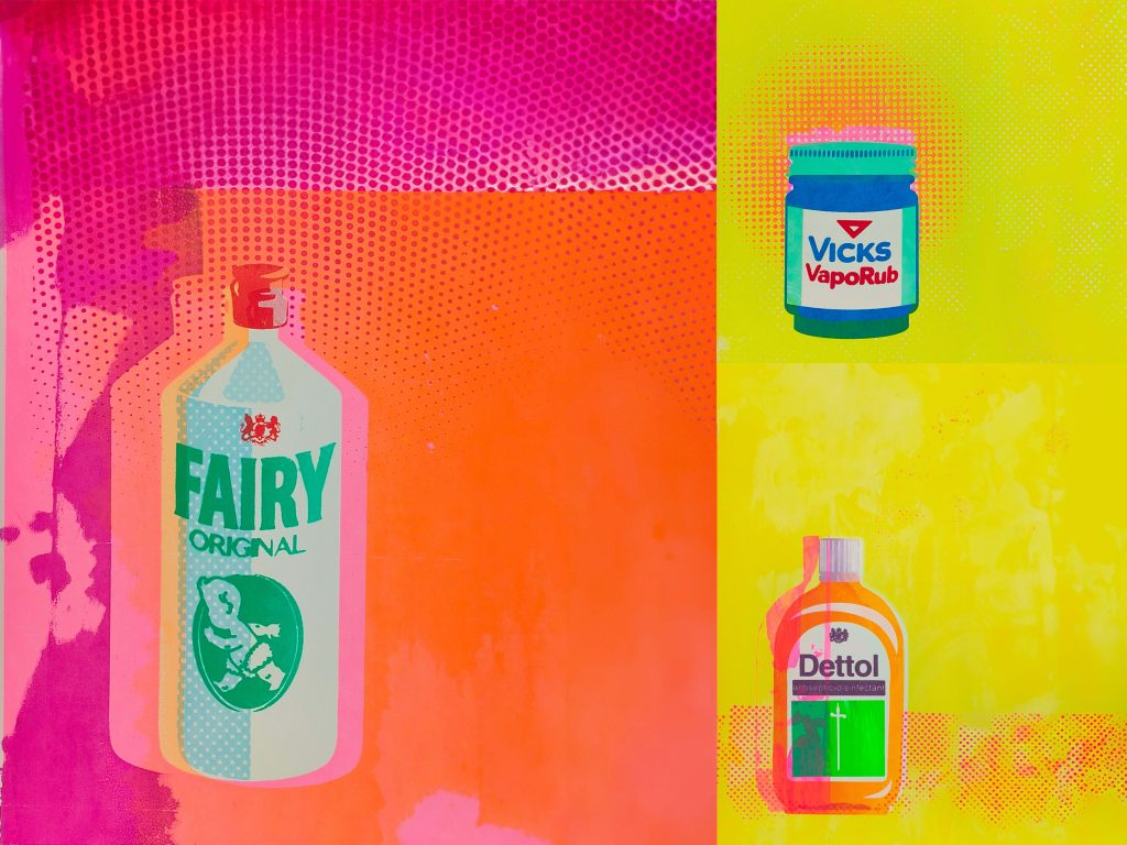
One exhibition that particularly caught my eye when I first wrote this in 2024 was Carey Bennett’s Memory & Remedy. The screen-print artist explored her relationship with familiar brands and memory, revisiting products she associated with childhood sickness through vivid colours and familiar typography. With both of her parents living with dementia and the roles reversed, those same everyday objects became part of a much more personal story about memory and care.
That relationship between brands and memory is something the Museum continues to explore through its Living Brands programme. It uses familiar products and multi-sensory activities to encourage reminiscence and connections for people living with dementia, their carers and families.
It is amazing how these empty wrappers and cardboard boxes really do take you back. Being a child of the 80s, everything seemed yellow and red and blue. Bright, stimulating and fun.
Looking back for design inspiration
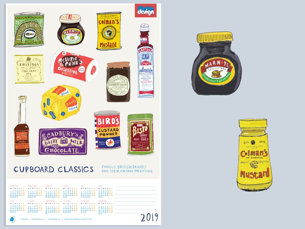
We at Pickle have delved into branding history ourselves. Back in 2019 I had the pleasure of illustrating the original form of some much loved brands. Lyle’s Golden Syrup, Marmite, Colman’s Mustard and Cadbury’s chocolate to name a few. All are still quite recognisable, although altered over the years.
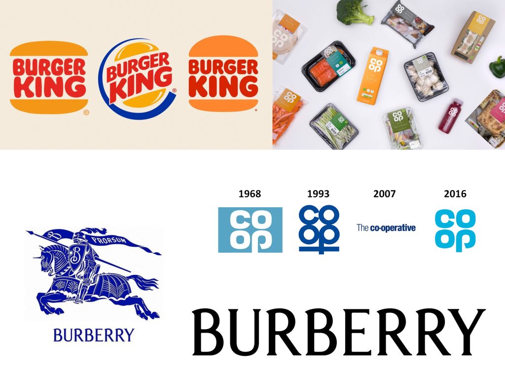
Next time I’m in London I must saunter around this fab place to get those creative juices flowing. Our fascination with retro often feeds into new designs too. You see it time and again when major brands revisit earlier parts of their visual history, whether that is an old logo, familiar typography or a colour palette that sparks a memory.
Perhaps that is part of the appeal. Familiar design makes connections in our brains before we have even really thought about it. As AI becomes a bigger part of the design world, there is something rather comforting about looking back at the handmade, printed and beautifully ordinary things that came before it.
There is always something we can learn from the past when looking to the future of brand design. If old packaging appeals to you too, I have also explored the subject in Vintage Stationery Packaging.