Journal topics
- Art (61)
- From the Studio (44)
- Architecture (38)
- Interiors (38)
- Graphic Design (37)
- Illustration (32)
- Product Design (31)
- Photography (29)
- Fashion (11)
- Design Classics (9)
Judith Bergerson
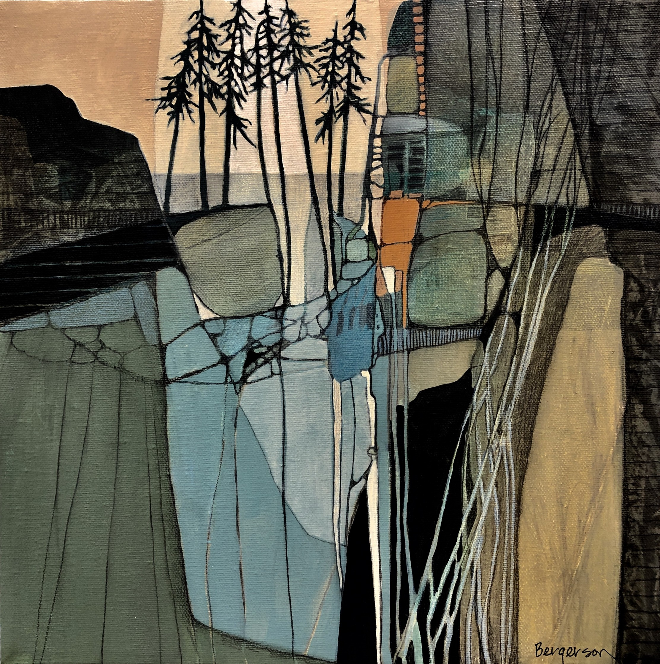
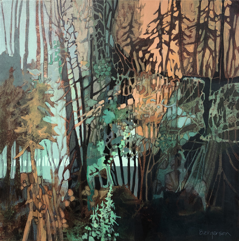
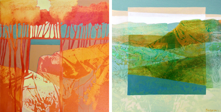
I just came across artist Judith Bergerson and I am loving her Art Nouveau leanings and the way she divides her landscapes into geometrically contained patterns. She paints in her native Wisconsin, along the Mississippi River exploring the abstract and figurative.
Between landscape and abstraction
That Art Nouveau connection is something I see in the work rather than a label Judith uses herself. On her own site, she describes a lifelong fascination with shapes, textures, lines and the relationships between them. She is particularly interested in contrasts, from warm and cool colour to hard edges and soft transitions.
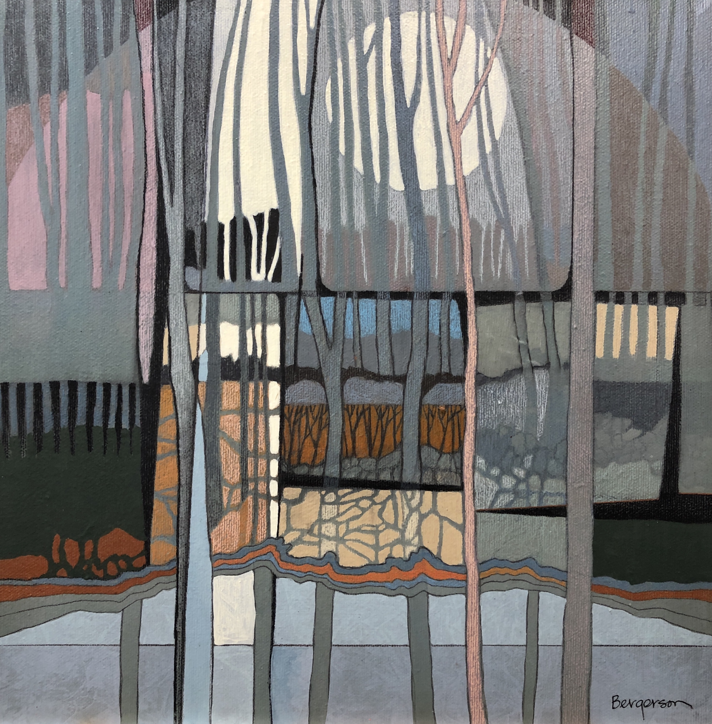
There is often something recognisable to hold on to, a shoreline, a group of trees, a moon or the suggestion of a horizon, but the landscape isn’t allowed to dictate everything. Judith sometimes begins with a fairly realistic subject and then moves away from the original reference, allowing the painting itself to determine what happens next. At other times she begins with colour and texture and gradually finds the shapes within it.


Built up in layers
Judith works primarily in acrylic, collage, mixed media and drawing. For her paintings, acrylic particularly suits the way she works because it dries quickly enough for her to build up layer after layer. In her mixed media pieces she combines materials freely, using collage, pencil, crayon and paint according to the effect she is trying to achieve.

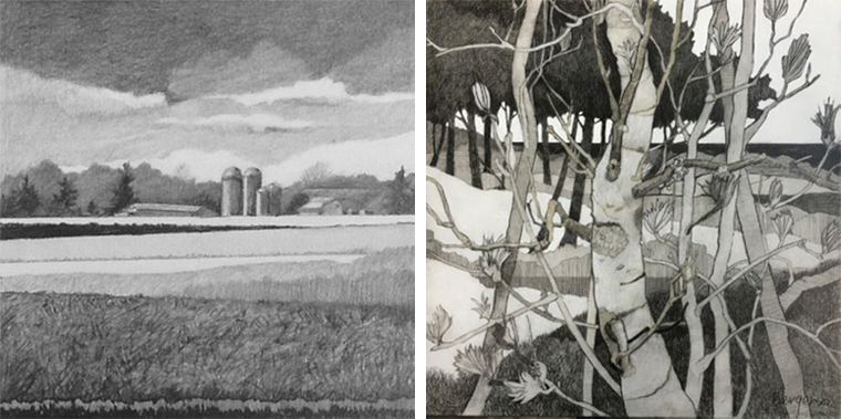
I enjoy the colours, dappled like sunlight through trees. Her drawings are quite graphic, filling the space with line and pattern. A happy find to inspire my day.
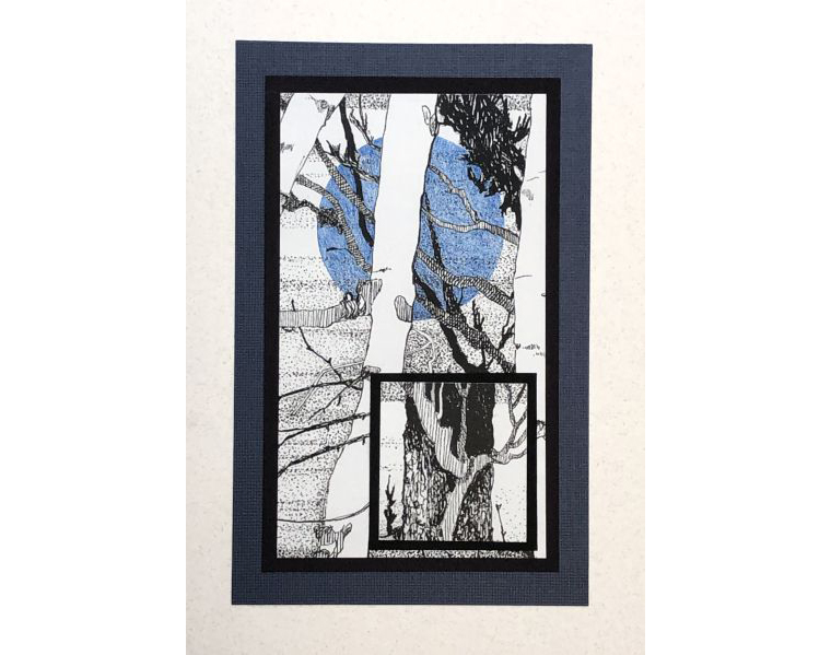
That use of line is especially interesting alongside the paintings. The same ingredients keep appearing in different ways, repeated shapes, divided spaces, grids, branches and blocks of colour, but without making the work feel rigid. The structure gives the eye somewhere to travel while the more organic marks keep things moving.

Landscapes remembered rather than copied
I particularly like the idea behind Judith’s Mindscape series. The paintings look like landscapes, but they are not depictions of particular places. Instead they come from her imagination, with the influence of landscapes she has known finding its way into the work.
It helps explain why so many of the images feel both familiar and slightly dreamlike. You can recognise the language of a landscape without needing to identify exactly where it is. Colour, pattern and structure are allowed to become just as important as the subject itself.

Shoreline Mosaic 2 is a lovely example of that balance. The trees, shoreline and moon are there, but so are the strong divisions, repeated marks and patches of colour that turn the landscape into something much more graphic.
Still exploring colour and form
Judith is still making work today, and it is interesting to see many of the same ideas continuing to develop. Recent pieces move between landscapes, grids, natural forms, collage and more complete abstraction, while line and colour remain central to the work.
That meeting point between landscape and abstraction is something I have been drawn to before. I found a similar pull in the work of Irene de Klerk Wolters, although her paintings take a further step away from the recognisable landscape.
You can explore more of Judith Bergerson’s paintings, drawings and current work at JackPine Studio.