Penrose Touring Logo Design
A flexible identity built around the idea of a journey
When Penrose Touring asked us to help with their rebrand, we needed to create an identity that could bring several areas of the business together while still giving each one its own character.
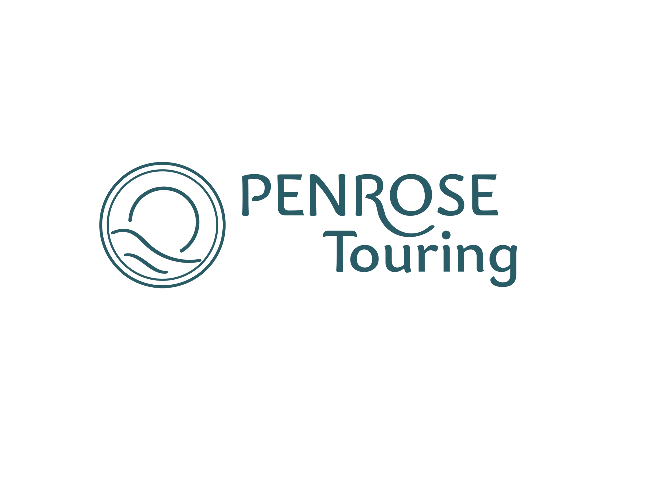
The logo grew from the idea of a journey. A flowing line can be read as both a road and a wave, while the circular form incorporates a setting sun – subtle references to travel, holidays and getting away.
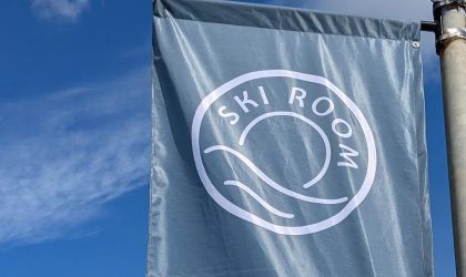
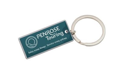
We developed the identity through sketches, consultation and different design directions before arriving at a system that could work equally well on large signage and much smaller applications such as key rings.
One brand, several uses
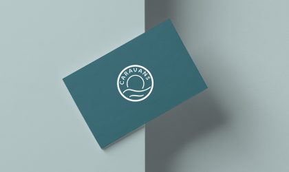
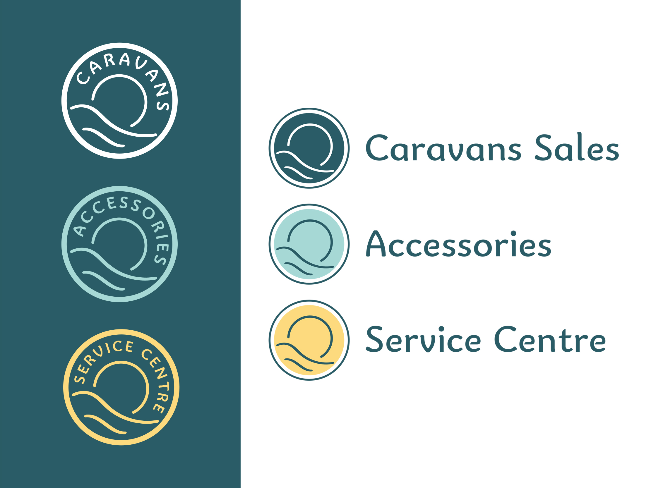
Colour became an important part of the system. The three areas of the business can be represented by simple circular marks, distinguished by colour and used either on their own or alongside the Penrose Touring name.
That flexibility gave Penrose a recognisable overall identity without forcing every application to look exactly the same – something that became particularly useful as the brand was rolled out across stationery, signage and promotional items.