Image 1 of 2
Wadebridge Wines
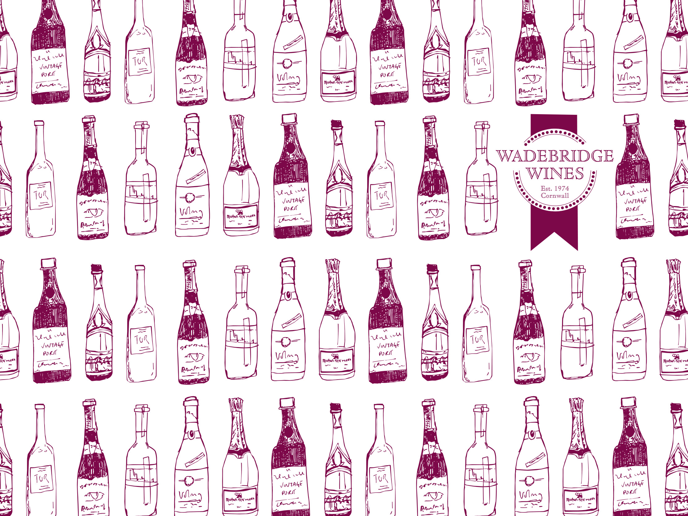
Wadebridge Wines, a well-established brand in Cornwall, approached us for a sensitive brand refresh. The goal was to update their identity without losing its familiarity.
Our solution was a complete branding toolkit. We retained their key elements, re-working them into a fresh, compact logo that emulates a wine bottle seal. To add flexibility, we also created a set of bespoke, hand-drawn illustrations. A new colour palette was introduced, pairing a bold pink with a deep grape to help the brand stand out.
Follow this link to see more examples of our logo design.
< Back to Wadebridge Wines