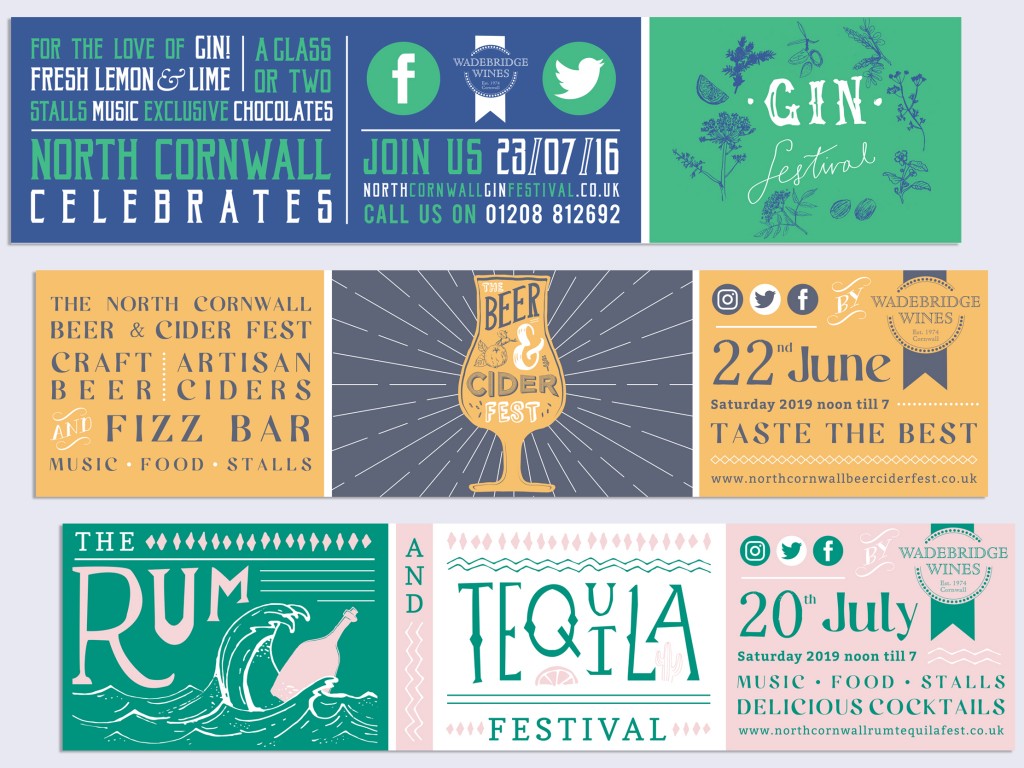
Outdoor Banner Design
To work alongside the posters and leaflets, large, eye-catching banners were designed and placed around the town.
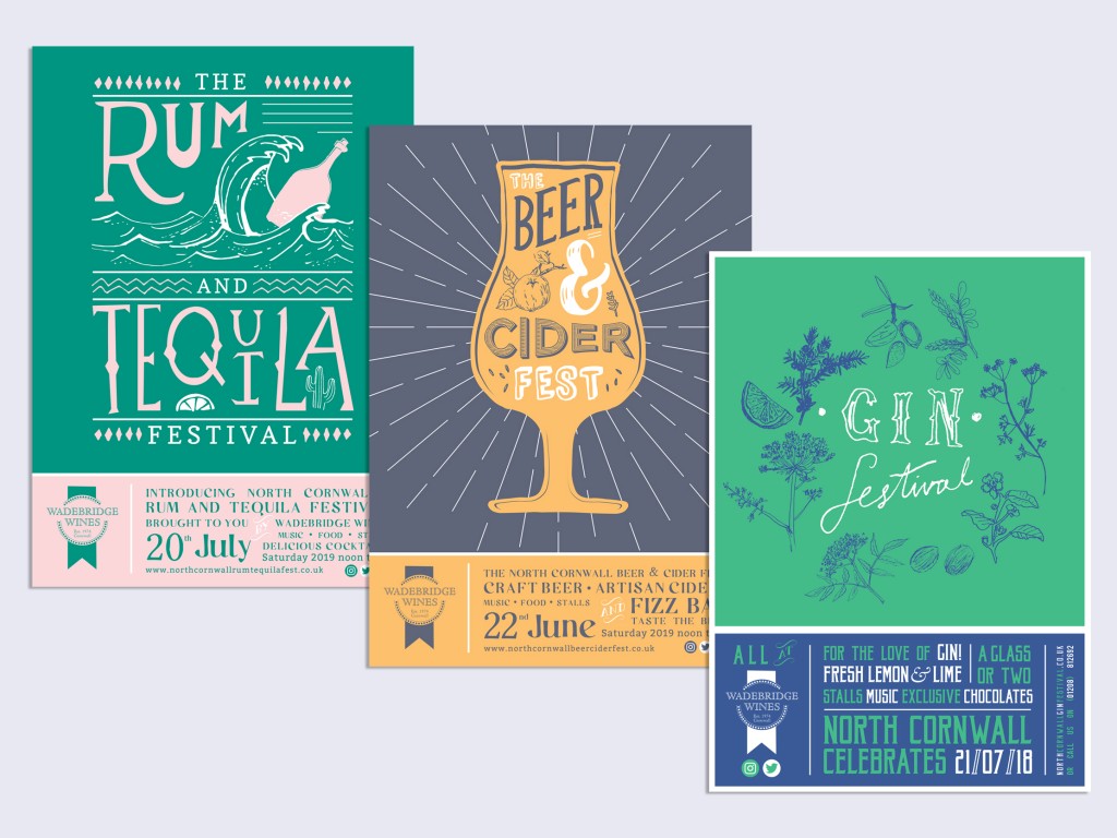
Poster Design and Print
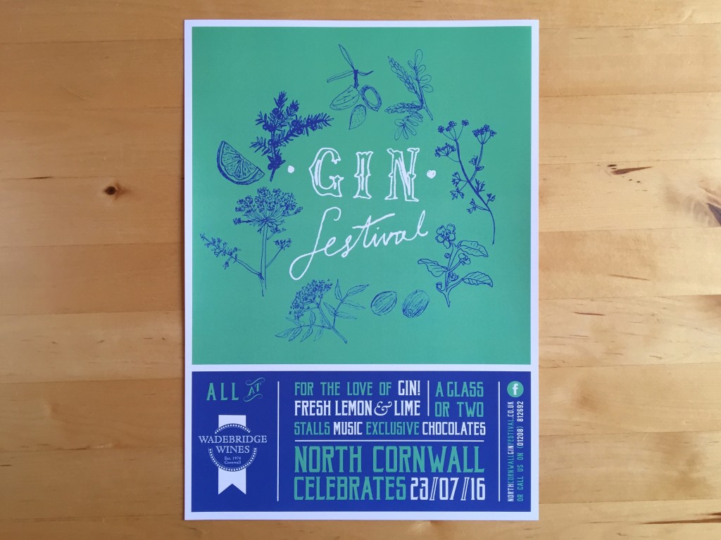
We designed a single sided A4 poster to highlight what's on offer on the day, using our illustration and typography.
Flyer Design and Print
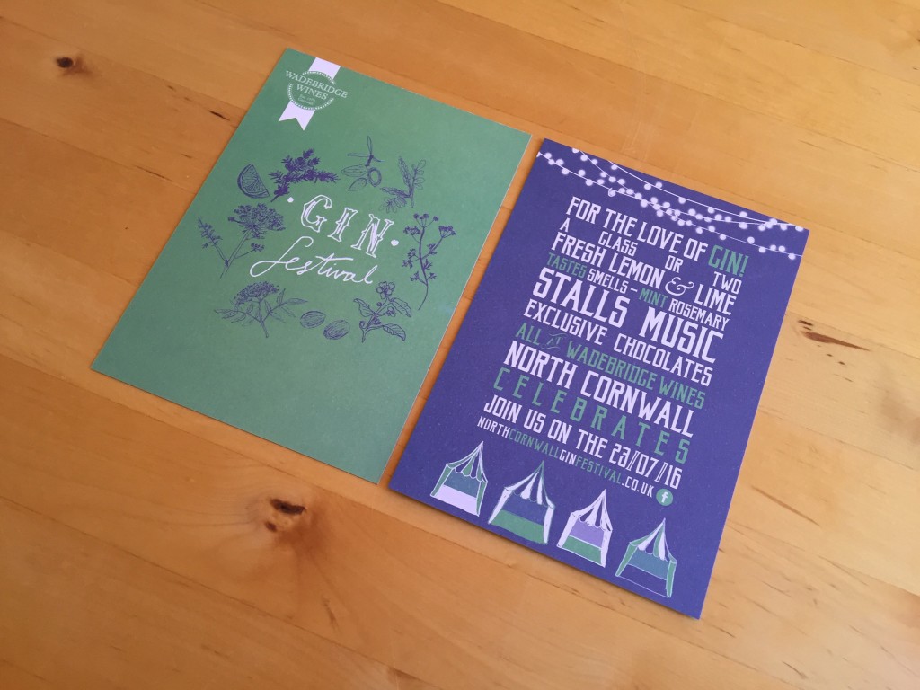
To promote Wadebridge Wine's summer gin festival we designed double-sided postcards. Ideal for event promotion, these A6 cards introduce the brand we designed in green and blue. The front shows the hand drawn logo with botanical illustrations and the back is a typographical run down of the festival.
Poster Design and Print
To complete the package f promotional print for the Gin Festival, we also designed and printed single sided A4 posters.
Wadebridge Wines Festivals
Wadebridge Wines approached us to assist promote their events held in and around Wadebridge. They held three festivals: the Gin Festival, North Cornwall Beer and Cider Festival and North Cornwall Rum and Tequila Festival. To promote these very appealing festivals, we designed and printed A6 flyers, A4 posters and large outdoor banners. The design for each festival aiming to communicate the theme of the events in bold colours and eye catching typography.
Follow this link to see more examples of our promotional design.
< Back to Wadebridge Wines