Image 1 of 3
Wadebridge Wines Festivals
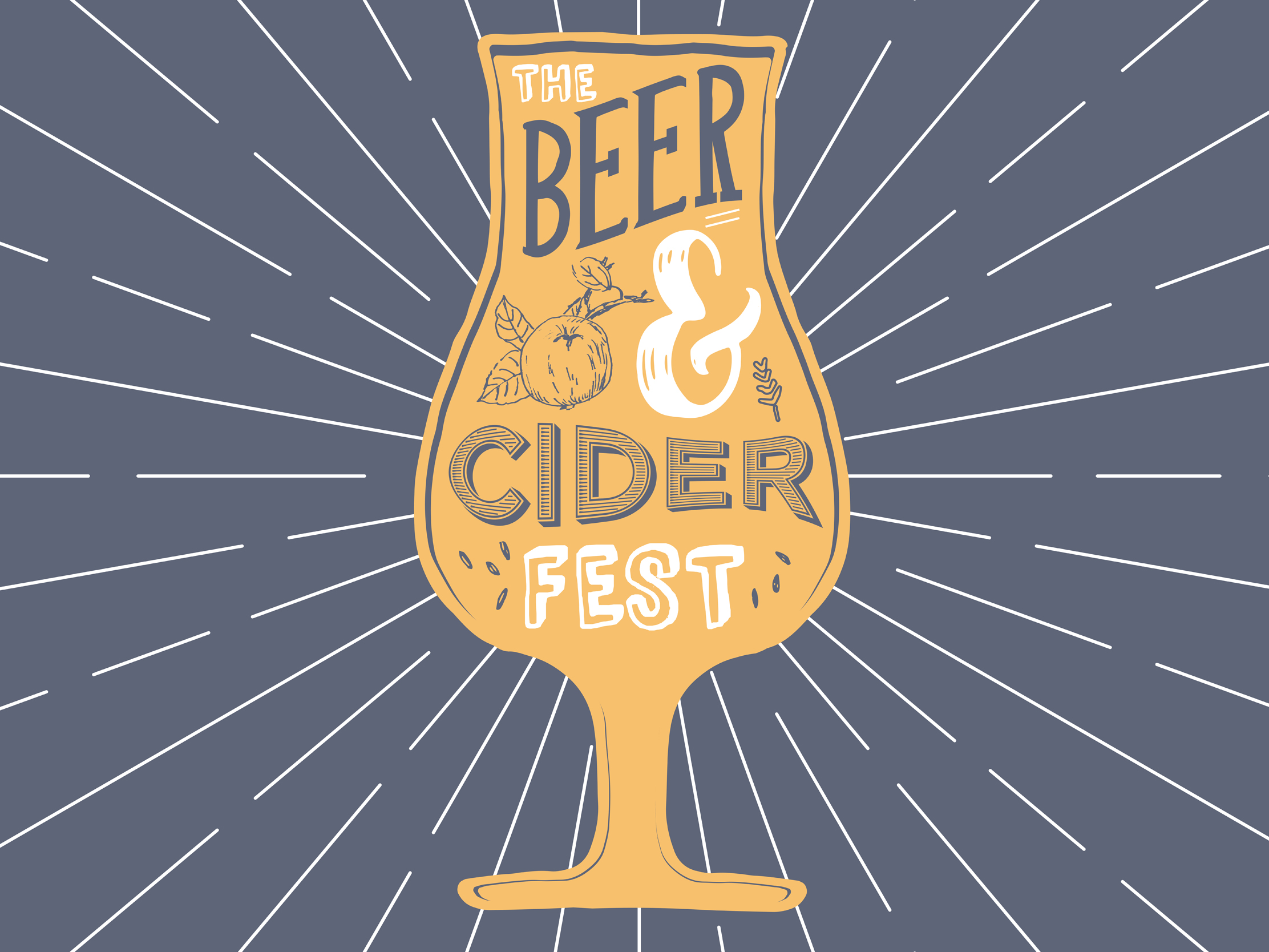
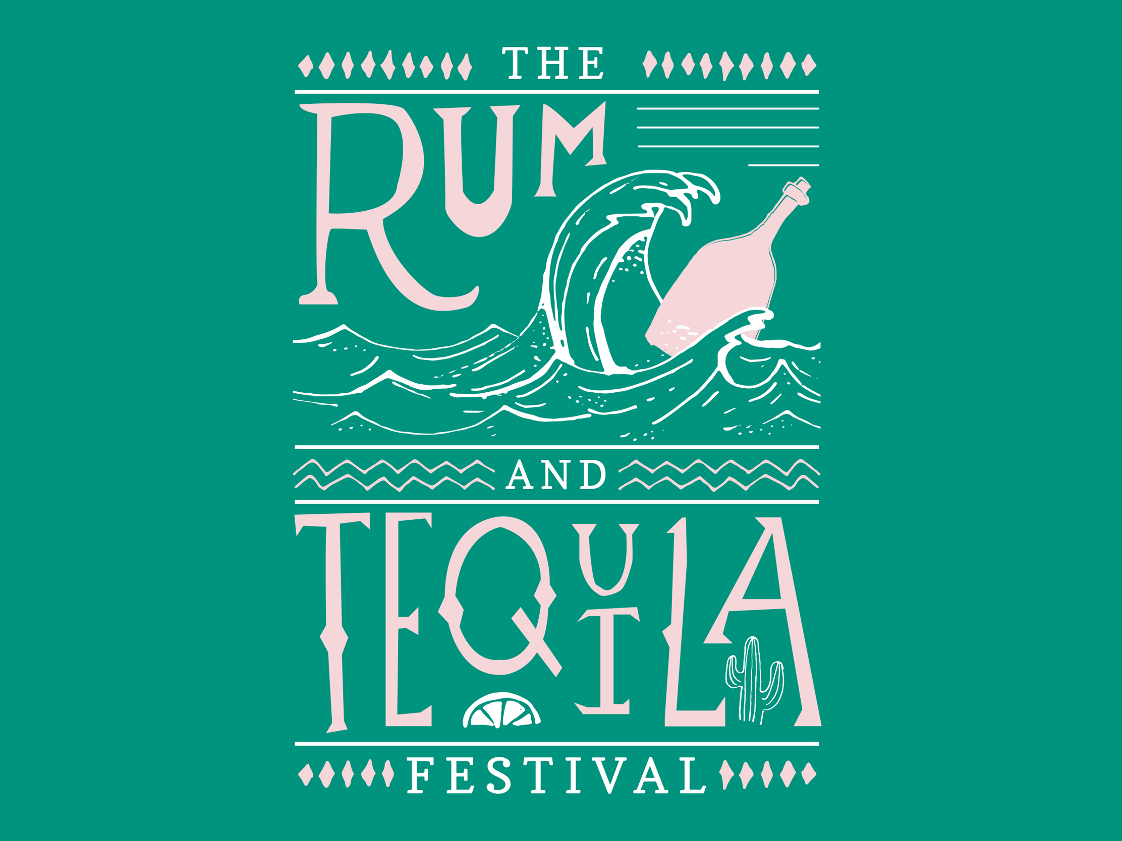
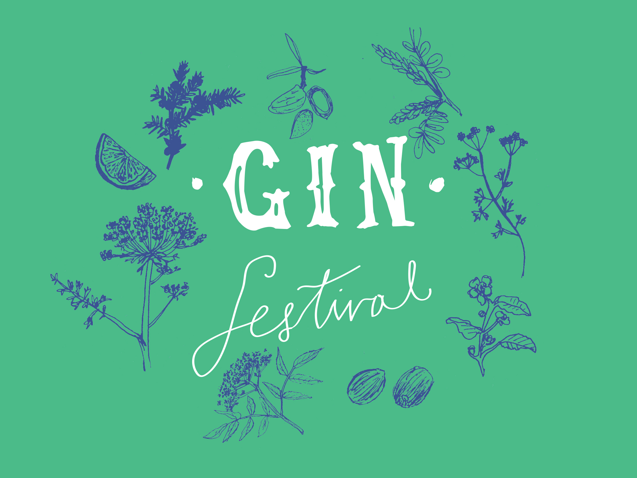
When Wadebridge Wines launched mini festivals to demonstrate that they are experts in more than just wine, they approached us to design identities for each of their themes. We stuck to a two colour palette for each of them, to tie them in with the brand we had designed for the wine merchants previously. Then we used illustration to create a parallel between the very different styles of each festival, held in Wadebridge, Cornwall.
The logo design for the events varied to reflect the ingredients and serving suggestions, taking in apples, limes and rum bottles at sea! So far, our clients have held the Gin Festival, Rum and Tequila and Beer and Cider–mouth-watering…
Follow this link to see more examples of our logo design.
< Back to Wadebridge Wines