
Menu and Loyalty Card Design for The Harbour Light
Bringing the brand into everyday use
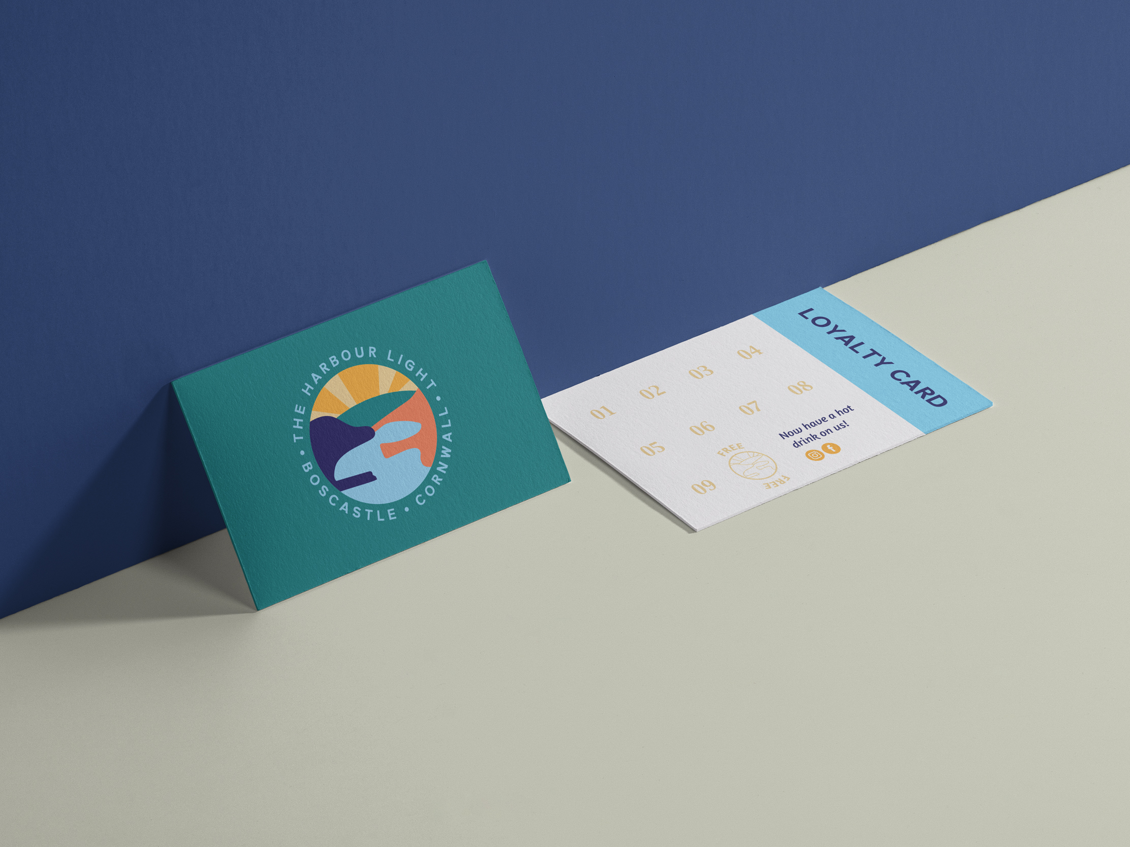
As part of the wider identity for The Harbour Light in Boscastle, we designed a menu and loyalty card that would carry the new branding through to the everyday customer experience.
The menu uses the colours, typography and illustration developed for the brand, with a clear, flexible layout that the team can edit themselves as dishes, cakes and prices change. This keeps the menu looking consistent without making day-to-day updates unnecessarily complicated.
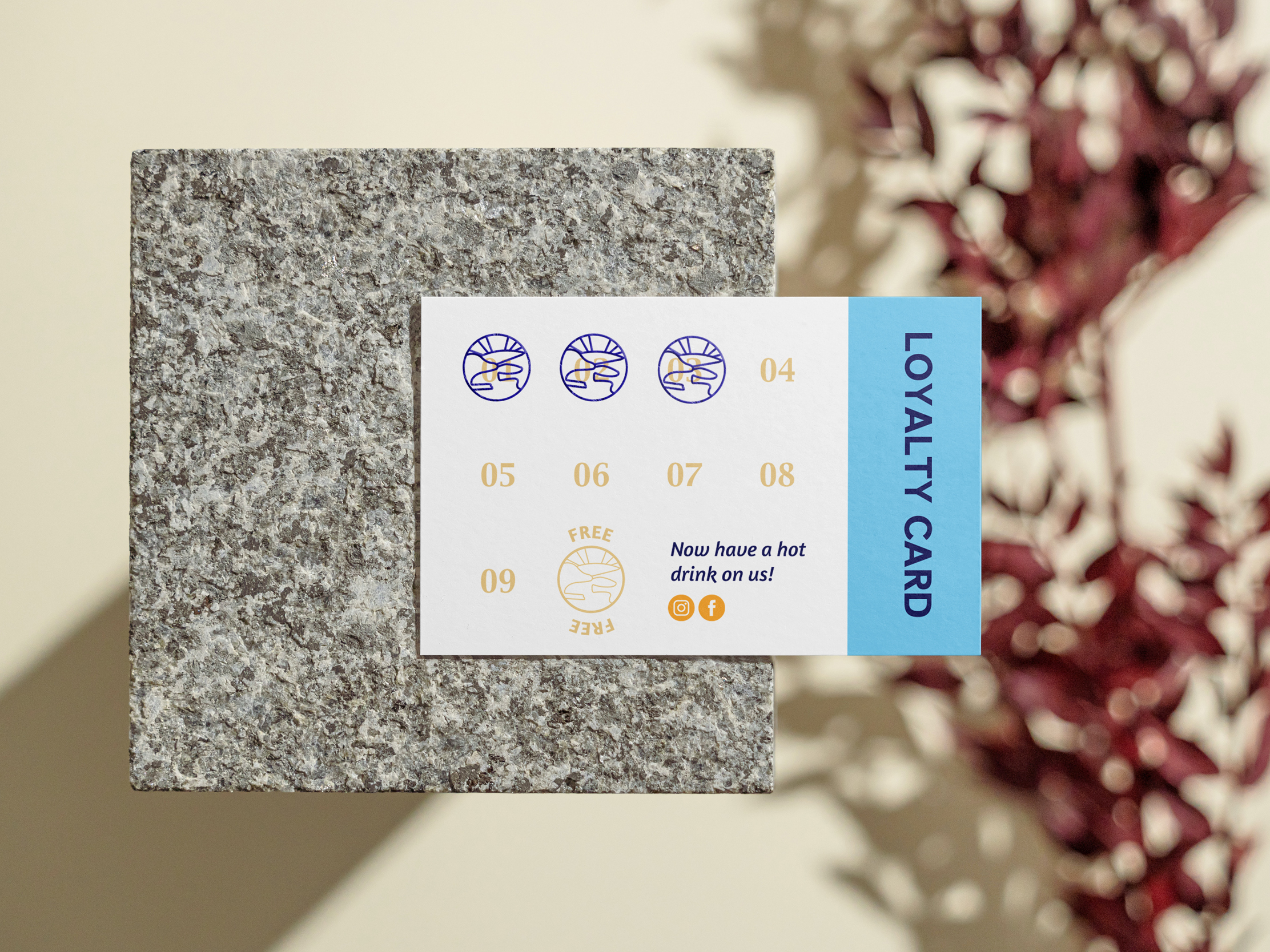
For the loyalty card, we used the teal, yellow and blue brand palette together with a bespoke stamp based on the linear version of the Harbour Light logo. Printed on a thick, uncoated stock, it gives customers another small but distinctive encounter with the identity.
More work for Harbour Light