Quay House Apartments
Brand Identity, Website & Print
Quay House offers three holiday apartments in a peaceful creekside setting near Padstow. We were asked to create an identity that reflected both the waterside location and the quiet character of the accommodation.
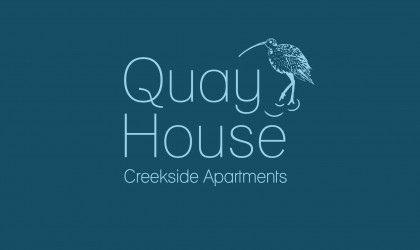
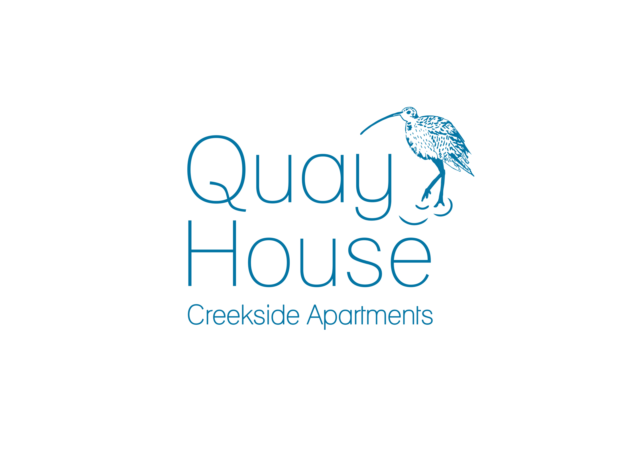
The logo combines fine typography with an illustrated curlew, while lines drawn from the tail of the letter ‘Q’ suggest the movement of water. A restrained palette of blues and greens gives the identity a calm, coastal character without relying on familiar seaside imagery.
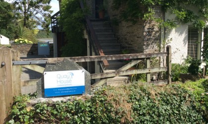
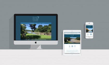
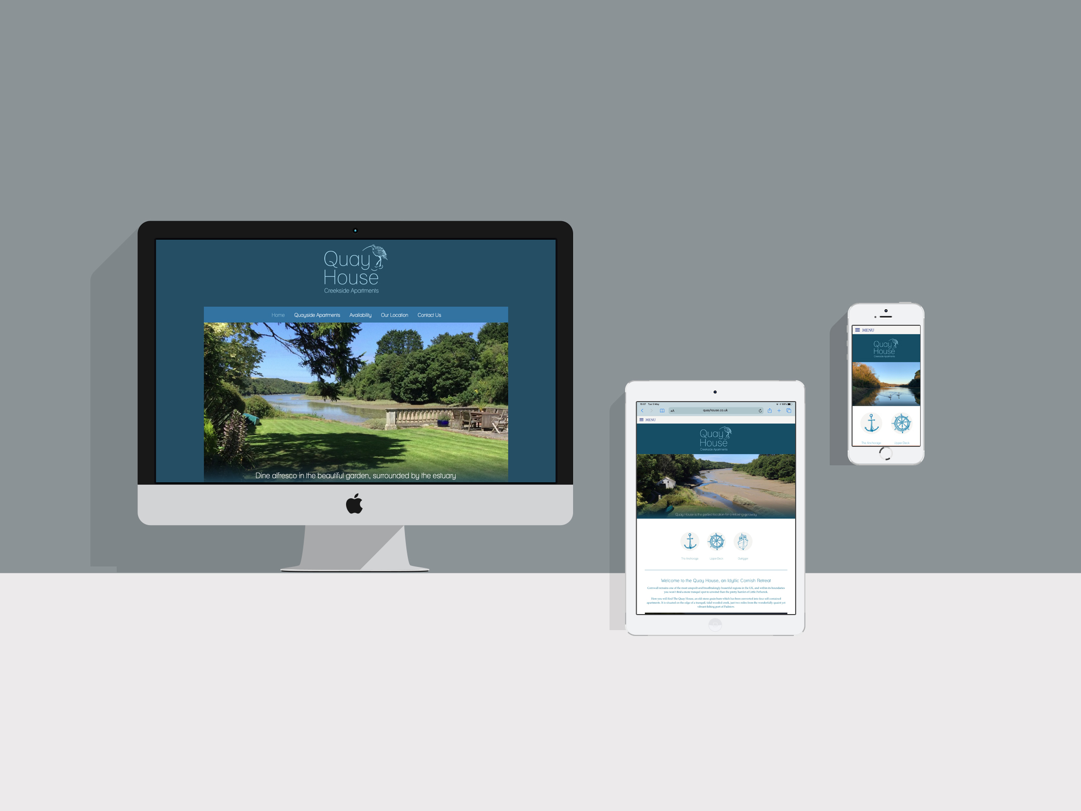
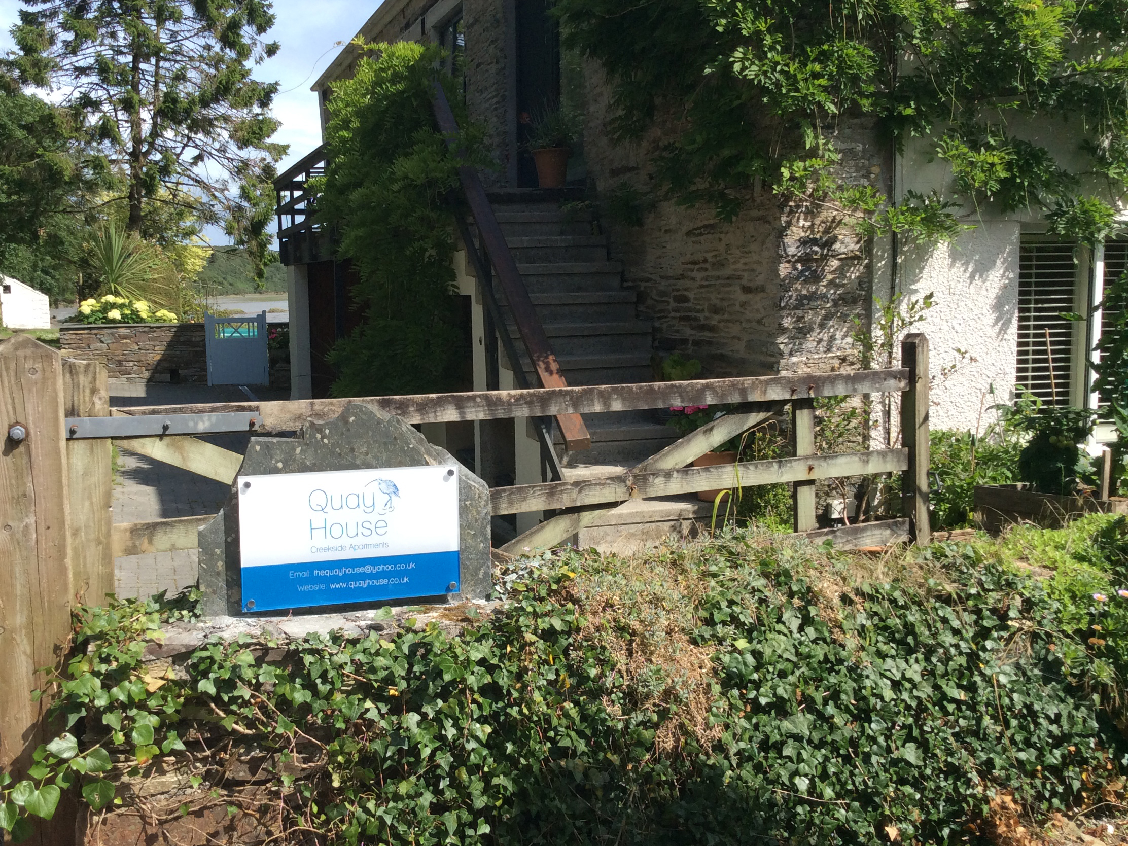
We carried the visual style across the Quay House website, using generous photography and a clear layout to introduce the apartments and their setting. The identity was also applied to exterior signage, making the property easy to recognise while remaining suited to its surroundings.
The colours, typography and illustration were also brought together in a pair of postcards. One features a view along the creek, while the other uses a hand-drawn map to place Quay House among Padstow, Rock and the surrounding villages.