
Image 1 of 3
Quay House Apartments
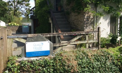
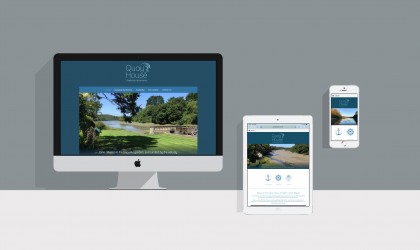
Quay House approached us to create a new brand for their accommodation. In this logo design we wanted to evoke the idyllic location of their luxury apartments, quietly tucked away on a creek near Padstow. We used illustration and an elegant font, applying the design to multiple background colours.
Follow this link to see more examples of our logo design.