Image 1 of 4
Stationery Design for Wild & Free Cornish Campers
Carrying the identity into print
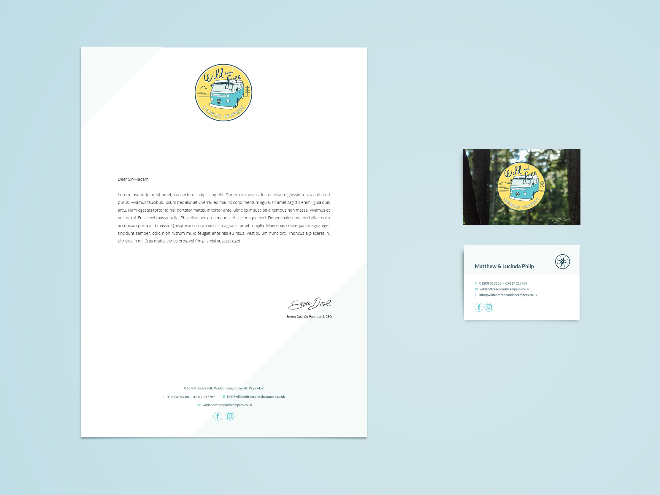
After developing the identity for Wild & Free Cornish Campers, we carried the same visual language across their business stationery. The aim was to make the letterheads and business cards feel immediately connected to the wider brand without overloading relatively simple, practical pieces of print.
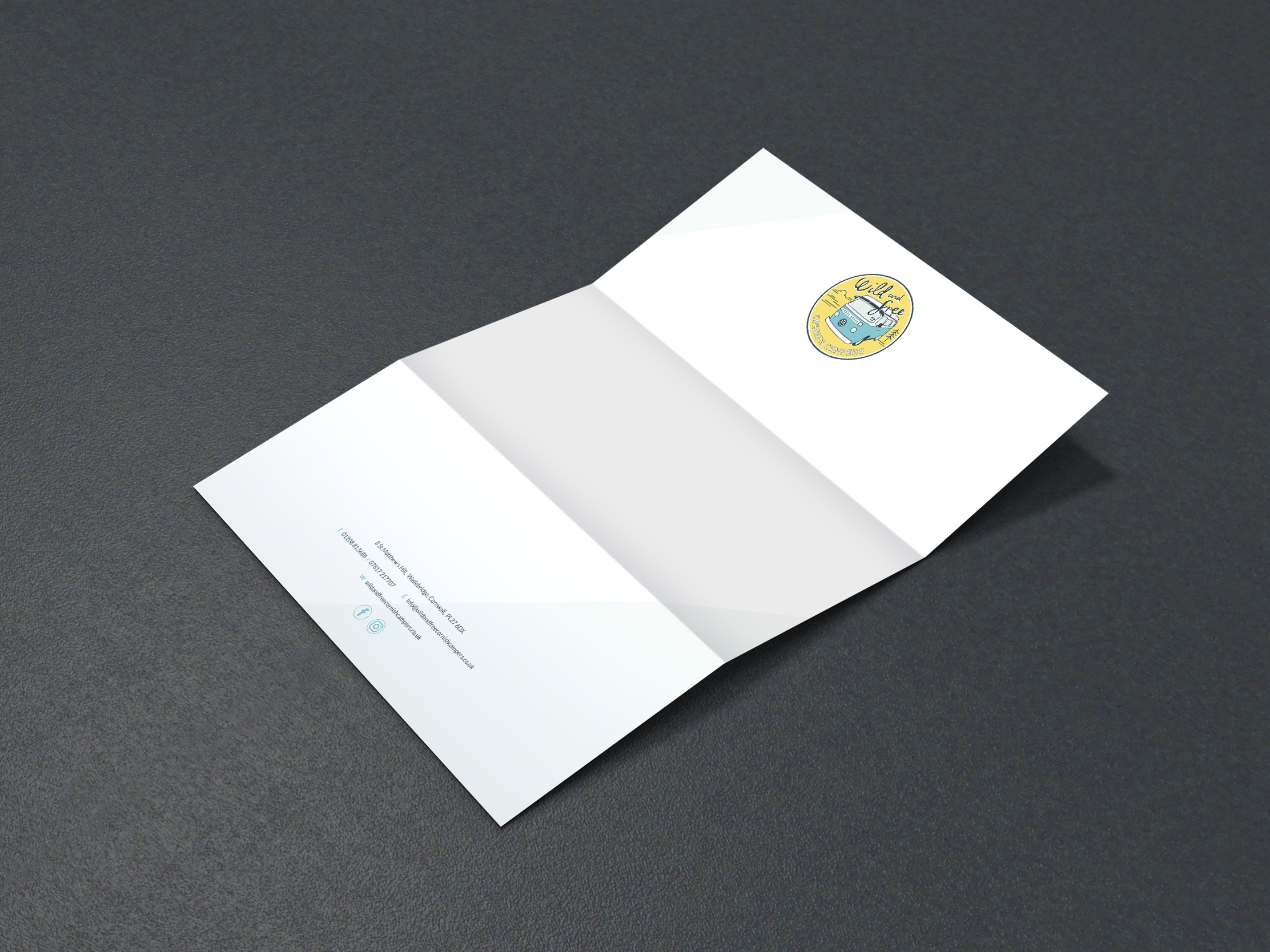
The letterhead keeps things deliberately restrained. The logo sits prominently on a crisp white page, with contact details kept clear at the foot and touches of sky blue adding just enough colour to make the piece recognisably Wild & Free.
Adding character through photography
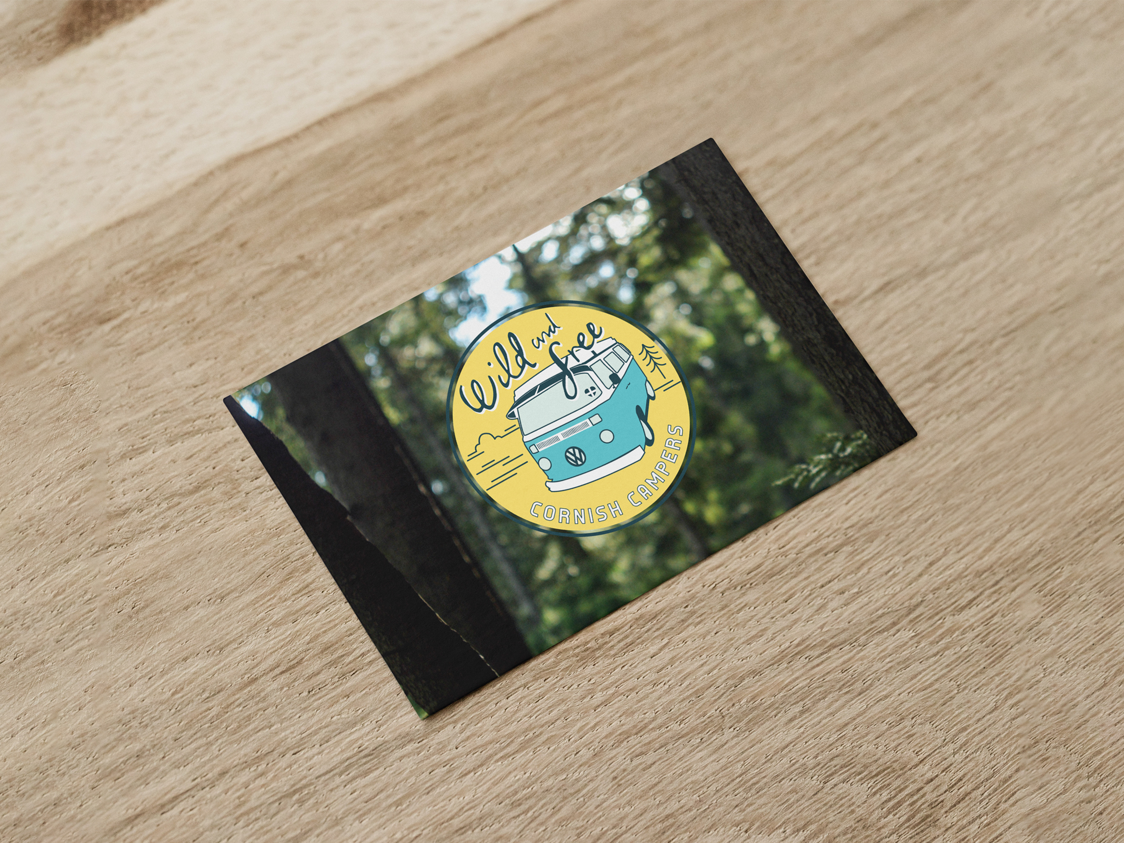
For the business cards, we could be more expressive. A woodland photograph creates a natural, outdoors feel on the front while giving the logo a strong setting, reflecting the freedom and adventure at the heart of the campervan experience.
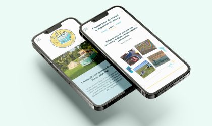
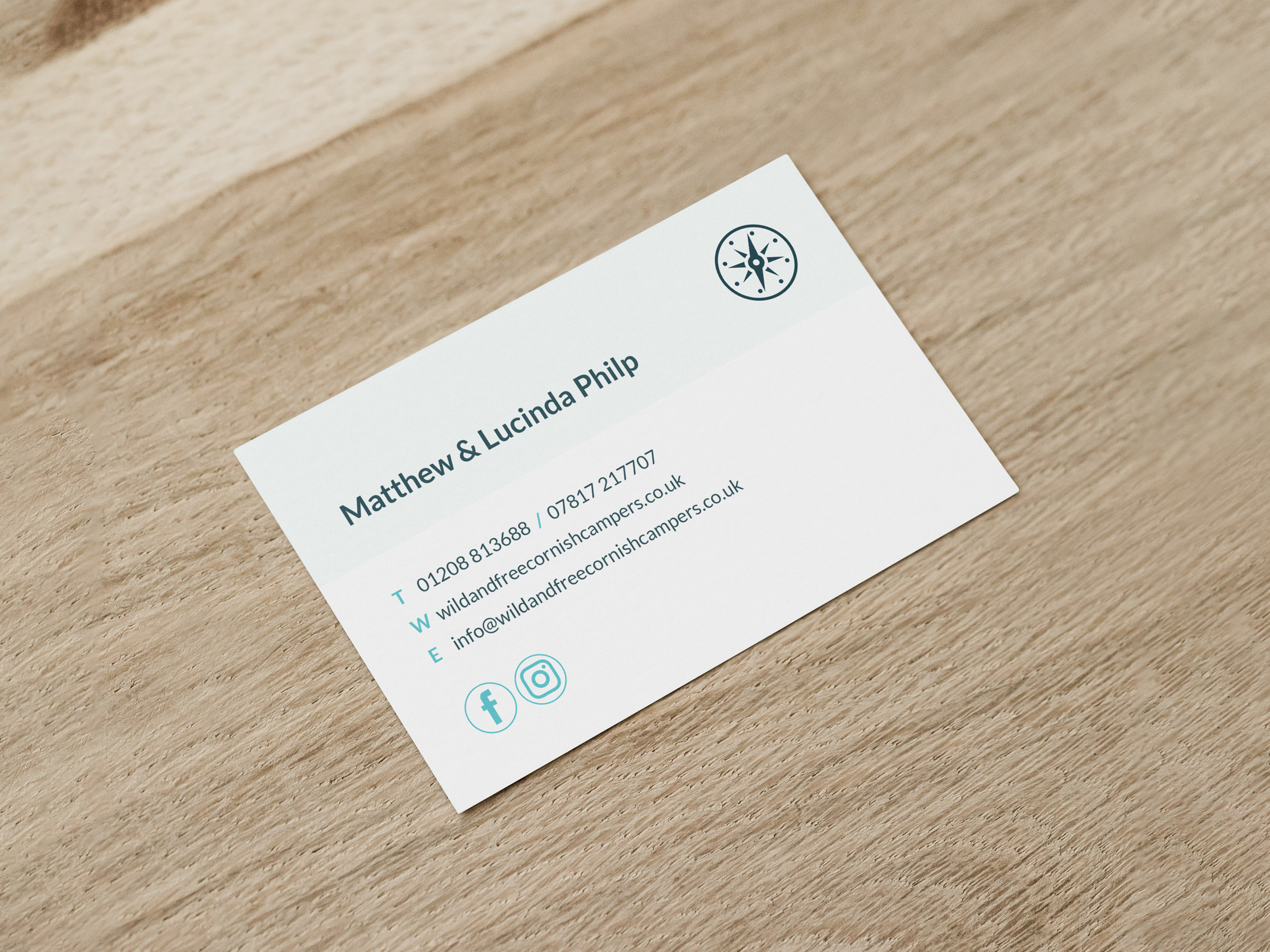
On the reverse, graphic details developed for the website are carried into print, including the circular treatment used for the social media icons. Together, the stationery creates a consistent thread between Wild & Free’s printed material, website and wider identity.
More work for Wild & Free