For their new brand we illustrated a fishing boat and used a bright, vibrant blue, together with a rich navy and slate grey. The logo was set in a circle, a handy format that has allowed it to be used on their aprons and loyalty cards among other applications.

The website was intentionally minimal, designed to be mobile-friendly and allowing our clients to edit it as required. We used a mixture of textures and images for the page backgrounds, and Polaroid style inset pictures to add more detail.
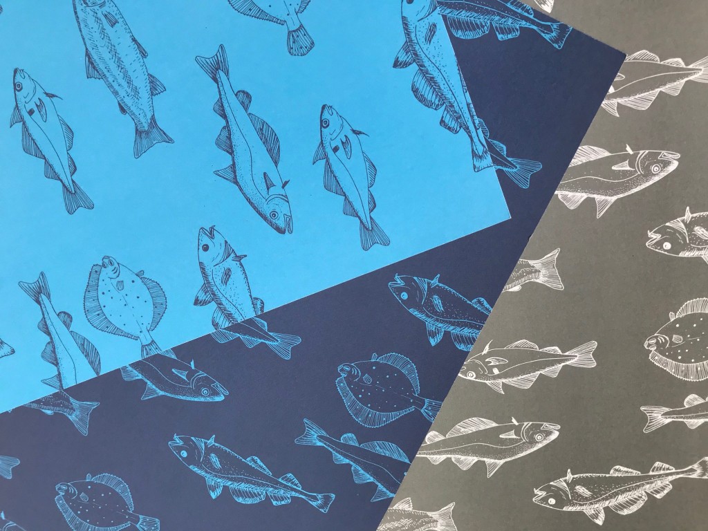
Along with their signature fishing boat, we also illustrated other elements such as anchors, fish and seagulls, these were used on menus and signs. We designed templates to allow our clients to change their menus, and printed menu cards for the restaurant, and leaflets for their takeaway.
Port and Starboard
After working with the Port and Starboard for many years, we had the opportunity to create a new brand. The award wining restaurant’s new owners wanted a contemporary and fresh aesthetic, while remaining grounded in its Cornish context. The project included new exterior and interior signage, menus, website design and stationery along with other applications. Located in Indian Queens, Cornwall, they continue to have a reputation of excellent food, and wanted their brand design to reflect this.
Contact us here if you have a similar project you would like to discuss.