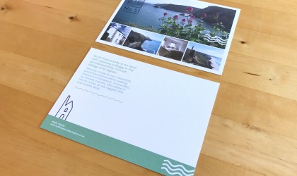
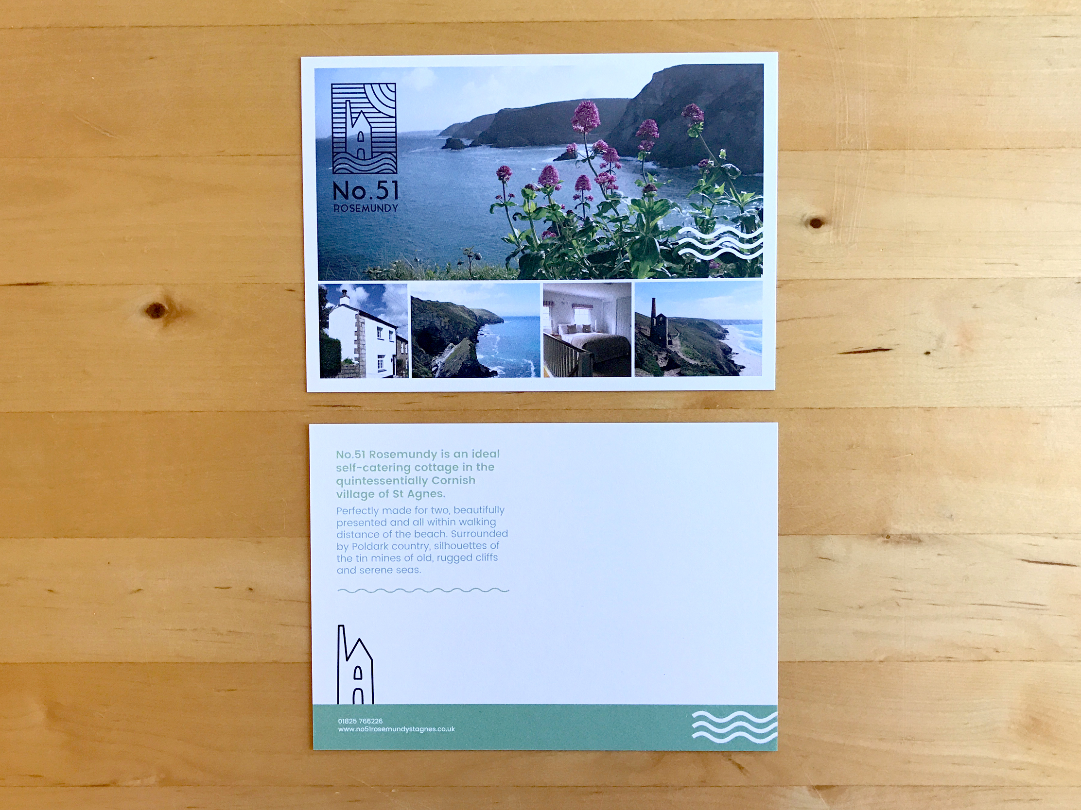
No.51 Rosemundy is a little holiday cottage in the beautiful village of St Agnes on our rugged north Cornish coast. They asked us to design them a logo. Our clients were keen for the brand to have a Cornish vibe that reflected the landscape of this special area so we illustrated a tin mine and the crashing waves in a contemporary style. We kept the logo succinct and bold in black and white choosing to add the colour to the web design. The cottage is named after the address so we wanted it to be bold typographically and to feel contained so it could work well any size.
We then applied the new brand to an A6 flyer which we printed uncoated. The front has a balance of property pictures and location shots with the logo overlaid. We picked up the waves from the logo and used calming tranquil greens.
The back has a little description of the property with the tin mine from the logo. There is space on the back so the flyer can double up as a postcard or complement slip.
Here is the responsive website we designed. We wanted to create quite a bold design, fresh and contemporary using the slate greys and verdant greens of the brand. The website adapts for the screen width, becoming more streamlined on a mobile devise.
We used plenty of scenic pictures communicating the stunning location of St. Agnes and kept the text clear and easy to read. Each page has an inset picture and our clients can add reviews. The home page includes an image carousel and the website also has an availability checker and contact form.
A really lovely project to work on, great to see it live!
