When creating the logo for Guillemot Press, we aimed to create a design that was fluid, like ink on a page, and works in either large or small formats. This versatility was essential, as it would need to be reduced in size to fit on the spine of a book.
As well as the main logo, we created two separate options for different applications. As the guillemot's eye is such a striking feature of these beautiful birds, we took that element from the main brand and set it alongside strong typography.
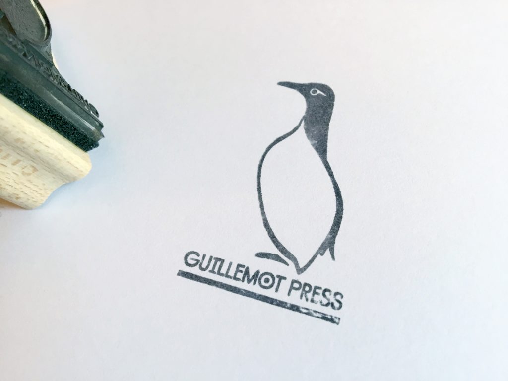
Guillemot Press also wanted a stamp, so we designed and supplied a wooden version instead of the more popular self-inking option. The beauty of stamps is their unpredictable nature–each impression is unique.
Guillemot Press
Boutique publishers, Guillemot Press, approached us when they initially set up their business looking for a strong brand. Based in Lostwithiel, Cornwall, they were looking for a bold marque that was monochrome and graphic. The name of their business gave us a great direction to pursue for their logo design, so we set to illustrating guillemots!
Contact us here if you have a similar project you would like to discuss.