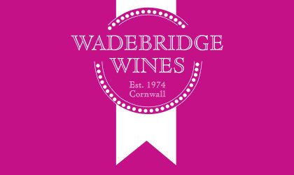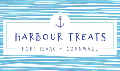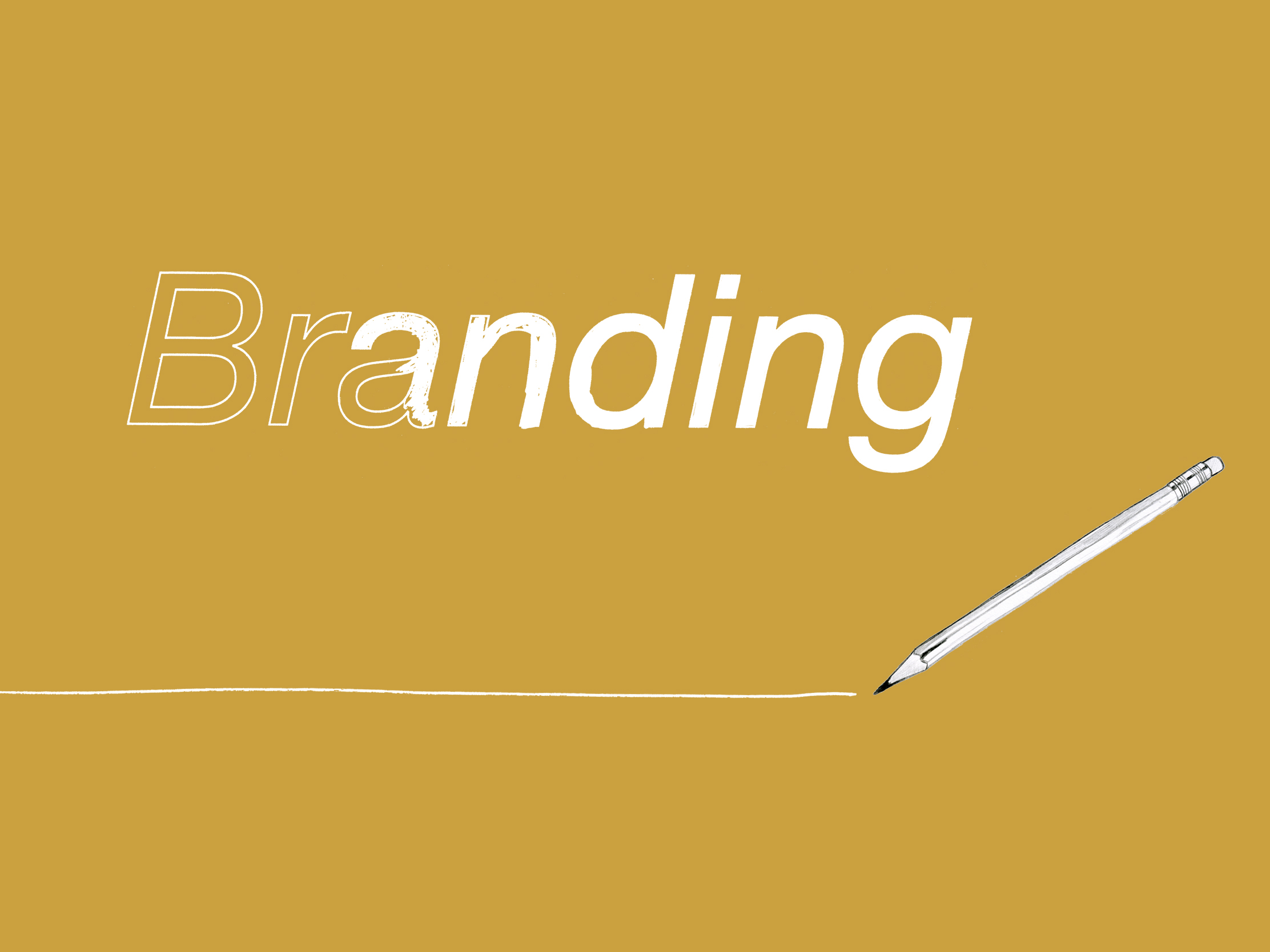
Branding and Logo Design
We provide branding in Wadebridge, Cornwall. When creating an identity or redesigning an existing brand we provide a flexible service; separating our options into logo design and branding.
A simple logo design package often which works best if our clients have a clear idea of the end result, while branding consists of more than simply creating a logo for you. We consider its application throughout your visual presentation and provide you with far more of our time and expertise to assist you in choosing the right direction.
This gives us the opportunity to explore the concept in detail, applying the design to multiple applications.
Feel free to talk to us about any branding or logo design projects you may be considering.